


Role: Researcher and Product Developer
Tools: Figma, Figjam and Whimsical
Skills: User research and synthesis, sketching, wire-framing, prototyping and testing
Timeline: 2 weeks
BrightGuard is North America’s leading automated sunscreen dispenser providing free, high-quality SPF 30 sunscreen where people work, play, and live. With over 5000 dispensers displayed across the United States and Canada, BrightGuard helps develop Sun Safety Programs for communities, aquatic centers, beaches, parks, golf courses, sports venues, and businesses.
Their mission is to significantly reduce skin cancer and sun damage by supplying effective sunscreen solutions for free where people need it most.


BrightGuard has well-established relationships with communities, parks and recreation departments and private venue owners who are good hosts for their program. Here’s how the program works:
Deployment
Sun Safety stations & towers featuring BrightGuard dispensers are placed in high-traffic venues and provide free high-quality SPF30. Customized sun safety stations and towers placed in these venues raise awareness for any brands who want to advertise.
Experiential Brand Marketing
Sun stations actively engage people in a memorable positive experience by highlighting sponsor brands in outdoor public settings not otherwise available via traditional marketing programs.
Benefits the Sponsor’s End Consumer
Promotes awareness, educates about sun safety and enables good sun protection for the targeted consumers of the sponsor brand's products and services.
Experiential Brand Marketing
Establishes sponsor as committed corporate citizen helping prevent skin cancer.
City & Partner Relations
Selection of highly desired locations
Collaboration and agreements with host city officials
Coordination of educational programs with sponsor and non-profit partners
Full Service Deployment
Set-up and teardown of sun stations
Coordination with city officials and maintenance crews
Weekly maintenance and service
Marketing & PR
Collaboration with your PR team to arrange a campaign kick-off event
Set up and oversight at special events
Social media and blog posts throughout the duration
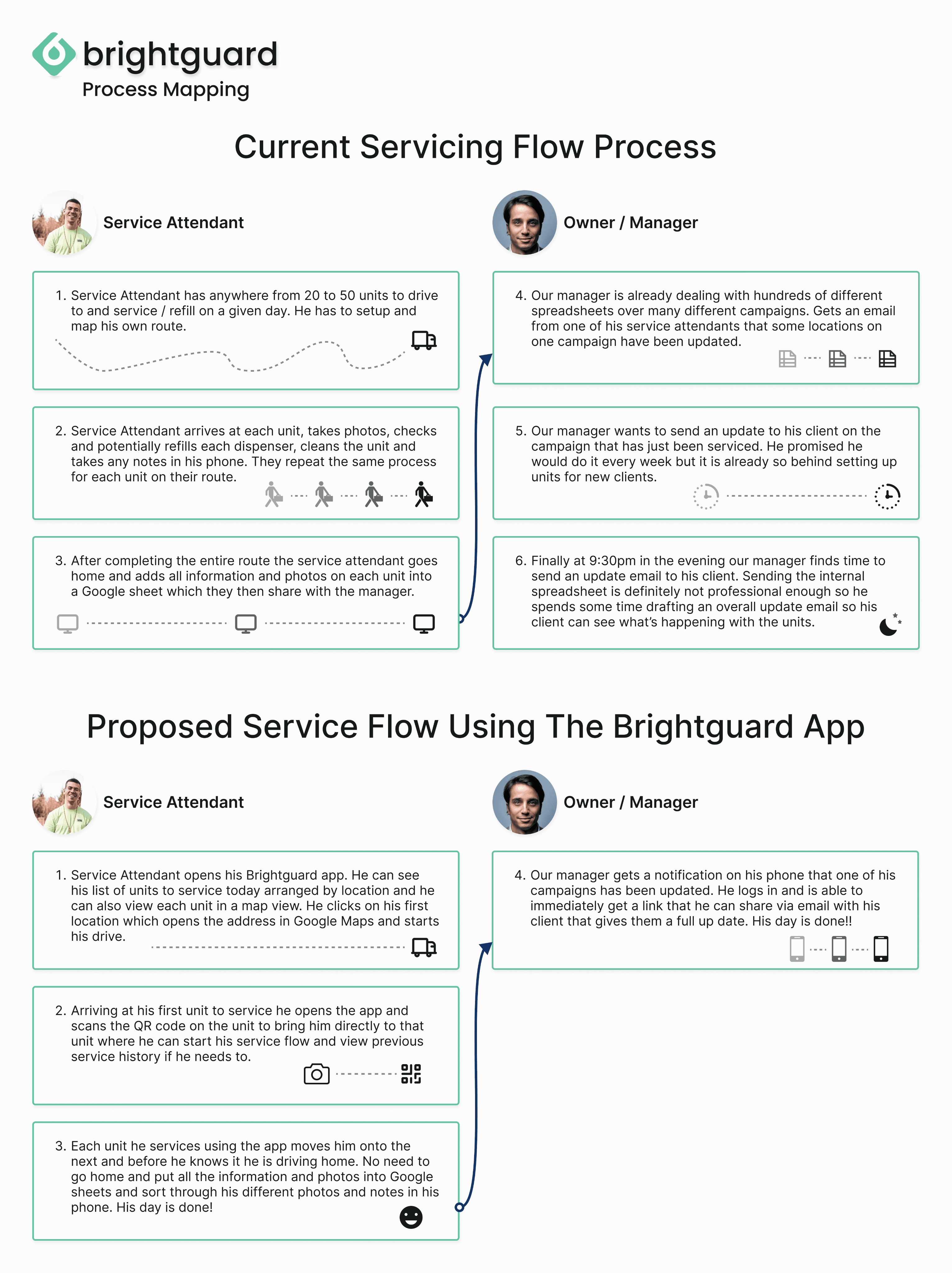
As a friend of Brightguard's owner, I discussed his business and existing digital solutions. Our initial conversation revealed a significant pain point in servicing dispensers, as the current maintenance management method is cumbersome and time-consuming for both the owner and service attendant. This leads to extra work hours and hinders timely client updates.
To address these issues, the proposal is to streamline the current workflow process and develop an all-in-one internal servicing and workflow application. This application would be accessible to managers and part-time service attendants, simplifying their tasks and improving overall efficiency.
Methods: Conduct user interviews on our owner/manager and current and previous Brightguard employees — analysis and breakdown of other delivery and 'gig worker' applications and task management applications
Goals: Gain a full understanding of Brightguard’s current method of servicing dispensers and updating clients. Gain insights into current pain points and other areas of difficulty. Through analysis of other applications get ideas of key features to implement in the Brightguard app
User Interviews
I conducted user interviews via Zoom and phone calls with the owner, current employees, and previous part-time employees of Brightguard, totaling five interviews.
The two biggest pain points that were uncovered had to do with the workflow of servicing dispensers once a contract had been landed and dispensers were setup. Everything is done using hundreds of spreadsheets for different campaigns and dispenser locations. Hence, it’s tough to stay organized, stay updated, update clients on what’s happening and the workload has many extra steps. The other is that the employees who are doing the servicing and maintenance on Brightguards’ dispensers are part-time gig workers. That being the case, Brightguard doesn’t always have the same people working for them. There is no easy system setup to on-board new employees on the job as well as share the information about where dispensers are located and what the step-by-step process is to service, refill and maintain.
Spreadsheets are the current technology used to update and store information and pictures on dispensers. Brightguard uses hundreds of these for their service, refill and maintenance workflow. It’s almost unmanageable.
I gained an excellent understanding of Brightguards’s maintenance and service process. This included how campaigns and dispensers are broken up from an inventory perspective as well as what kind of information should be included in an application to better serve the person using it.
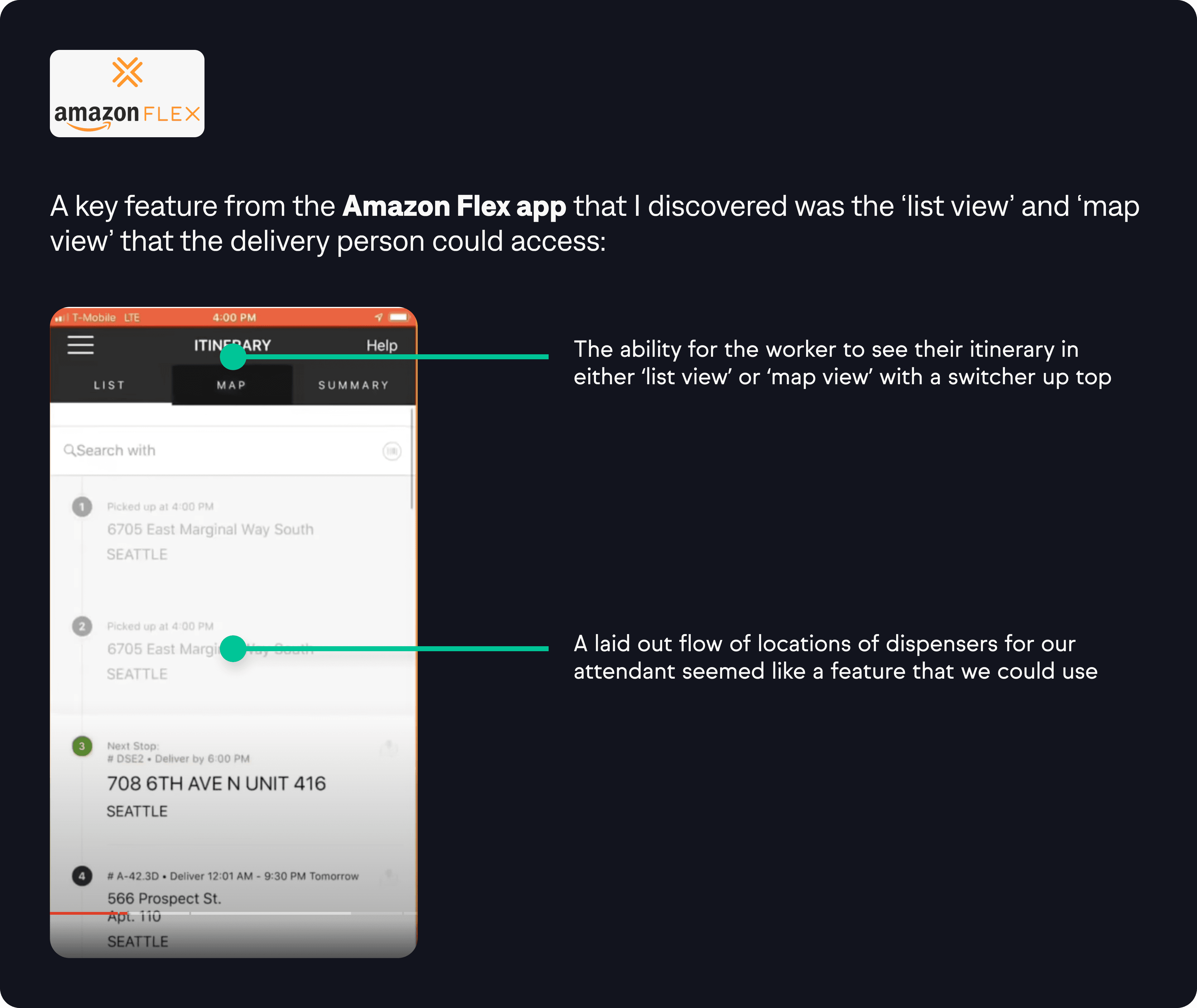
One previous part-time employee had the brilliant idea of having a QR code on the inside plates of the dispensers so you could scan it using the application to bring you right to that specific units service steps page.
Some previous research and development by our owner had been done on having sensors in the dispensers that could notify an employee when the dispenser was running low on sunscreen. It was shared that it would be nice to show how getting the notification might look with the application.
Our owner and users mentioned that if there was a Brightguard application, it should include an area of FAQs and troubleshooting videos to help employees.
After gaining a comprehensive understanding of the business and its requirements, I formulated two HMW (How Might We) statements to guide our persona development and future design efforts.
How Might We create a solution to the current workflow and data sharing while supporting the current technology of the business owner?
How Might We build a product that supports onboarding employees new to Brightguard?
After my interviews I determined that there were two user perspectives needed to consider moving forward.


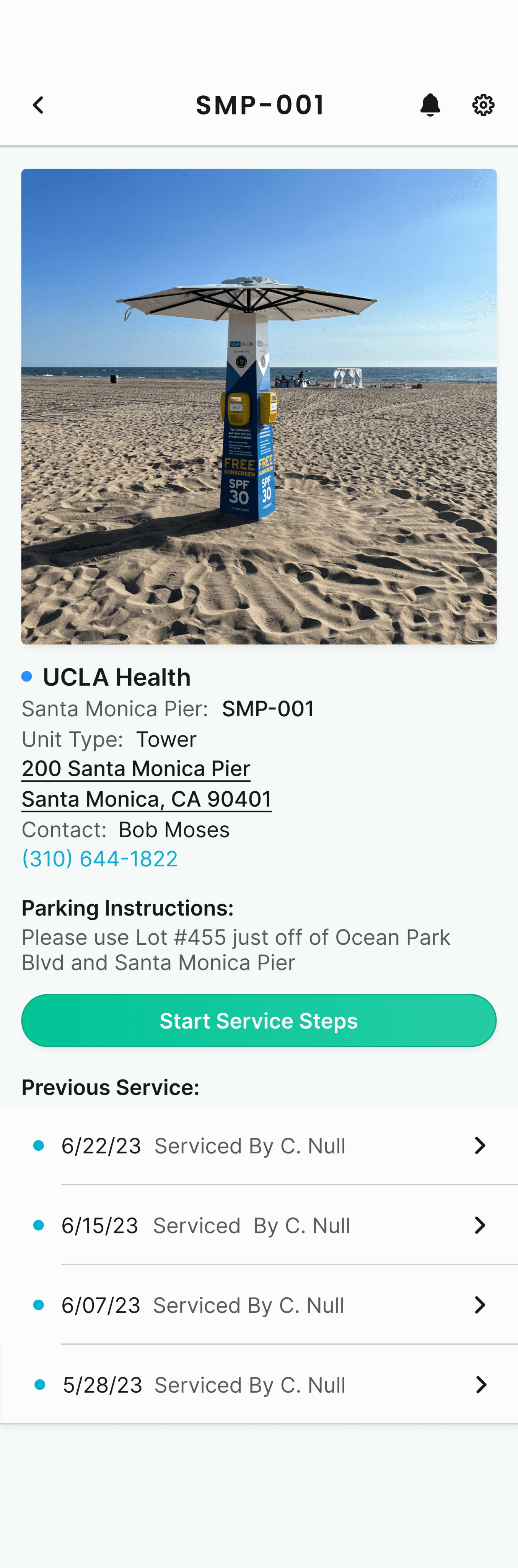
Understanding the hierarchy of campaigns, locations, and dispensers is crucial as Brightguard organizes its contracts with companies and venues in this manner:
Locations Examples: Santa Monica Pier, Zuma Beach, Venice Beach
Campaign Example: UCLA Health
Dispensers Examples: Santa Monica Pier: 15 dispensers, Zuma Beach: 7 dispensers, Venice Beach: 12 dispensers
To address the challenge of managing multiple campaigns simultaneously, I aimed to compare the current process with the proposed process. The goal was to provide our owner with a clear and straightforward understanding of our intended approach, as handling numerous spreadsheets and information by a single person can be overwhelming.
Through user interviews, I discovered that a former employee had attempted to implement Brightguards' service management into 'ClickUp.' To assess potentially useful features, I analyzed ClickUp and Monday.com.

From the service attendant's standpoint, I reviewed apps like Postmates, DoorDash, and Uber, focusing on the user side of drivers or delivery persons. I examined available options and came across videos of the Amazon Flex app, studying its functionality and user flow.
Methods: Site Mapping and Task Flows
Goals: Get first versions of the above to get a good overview of the application. Site Map and Task Flows will be reviewed as the project and design move forward
Combining insights from user interviews and feature ideas, I created a preliminary site map to gain a better overview of a potential app layout from the Service Attendant's perspective.

Next, I started to map out task flows from both a service attendant perspective and an administrative perspective.

Methods: Low fidelity wire-framing, company branding analysis and high fidelity mock-ups
Goals: Quick ideation of key screens for our task flows, evaluation to decide if current company colors and typography works for our application and a first version of high fidelity screens to review with our client
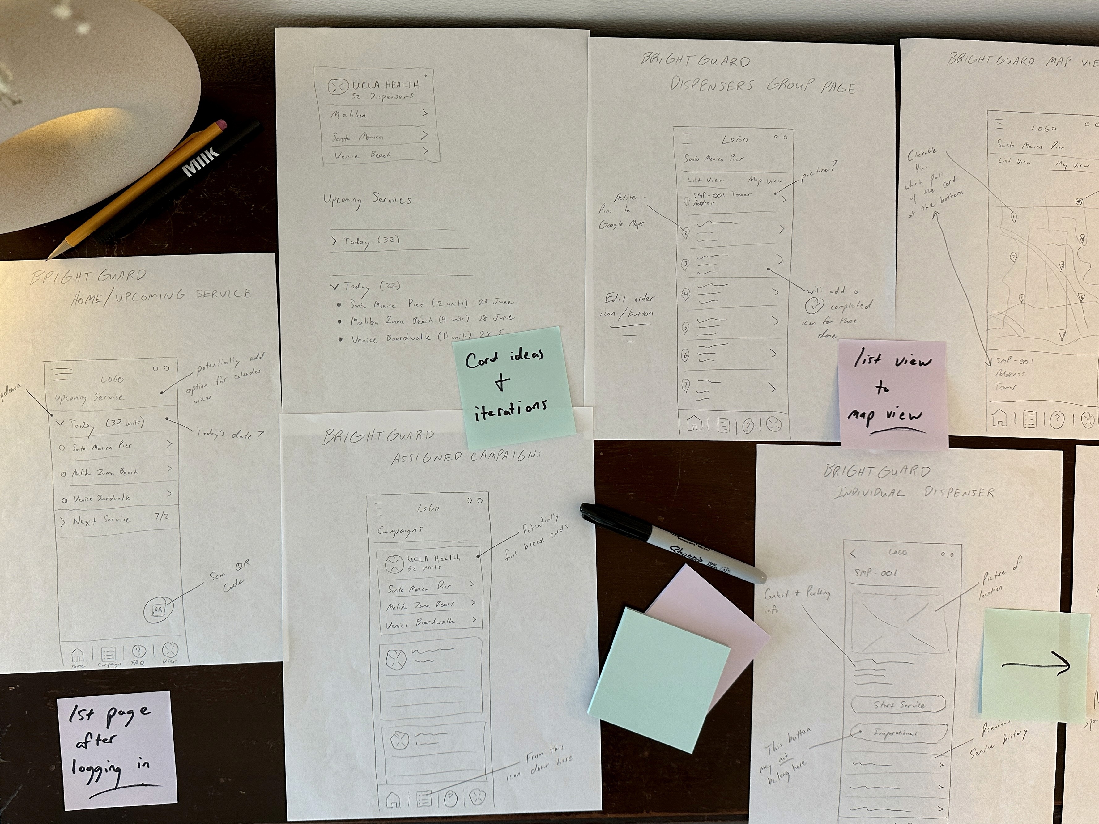
To quickly get ideas out of how the application could look and flow I sketched several versions of the following key screens:
Log-In
Home / Upcoming Services Page
Assigned Campaigns Page
Dispenser Group Page ‘List View’
Dispenser Group Page ‘Map View’
Individual Dispenser Page
‘Service Steps’ Page
Completed Service Card

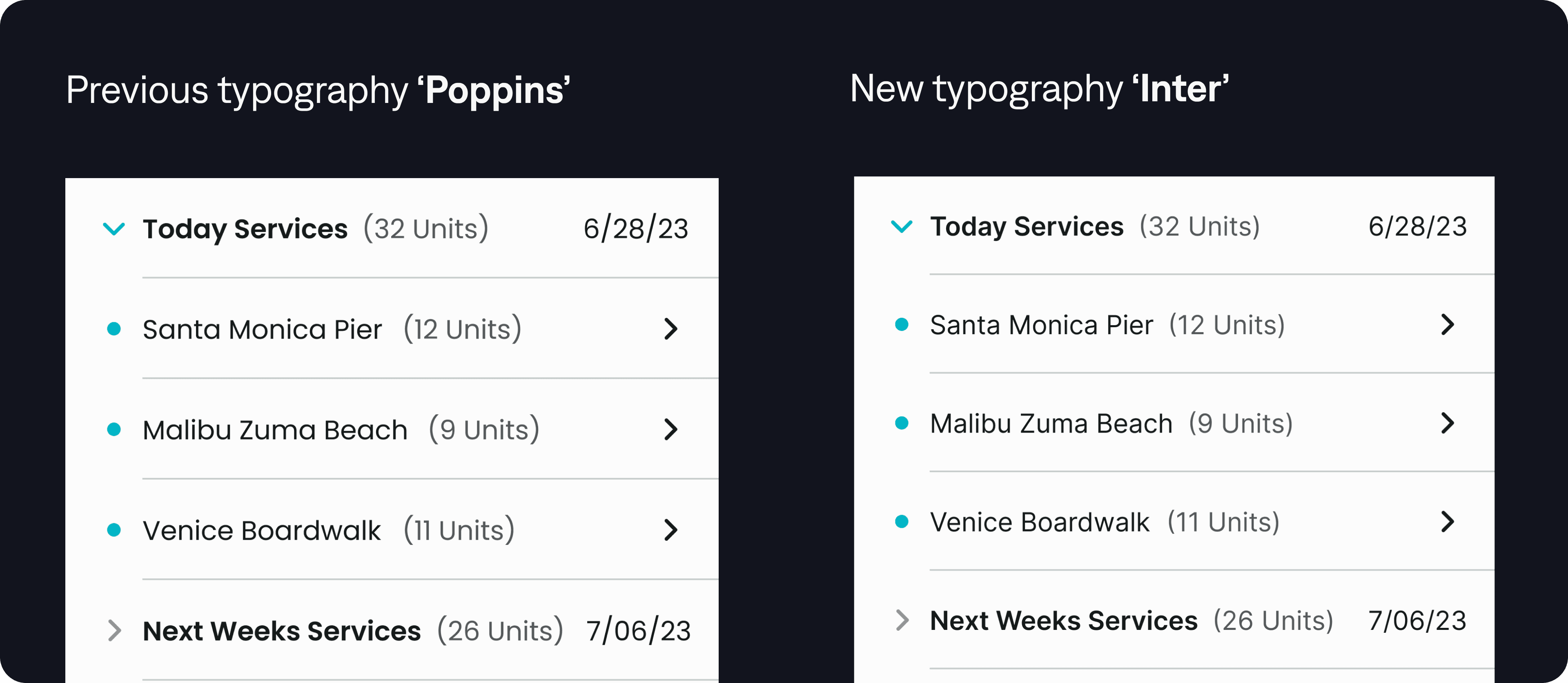
Brightguard already had a logo and branding in place, which I received from our owner. I wanted to use their primary green for the majority of my buttons but I needed to make some adjustments to account for contrast and visual accessibility:
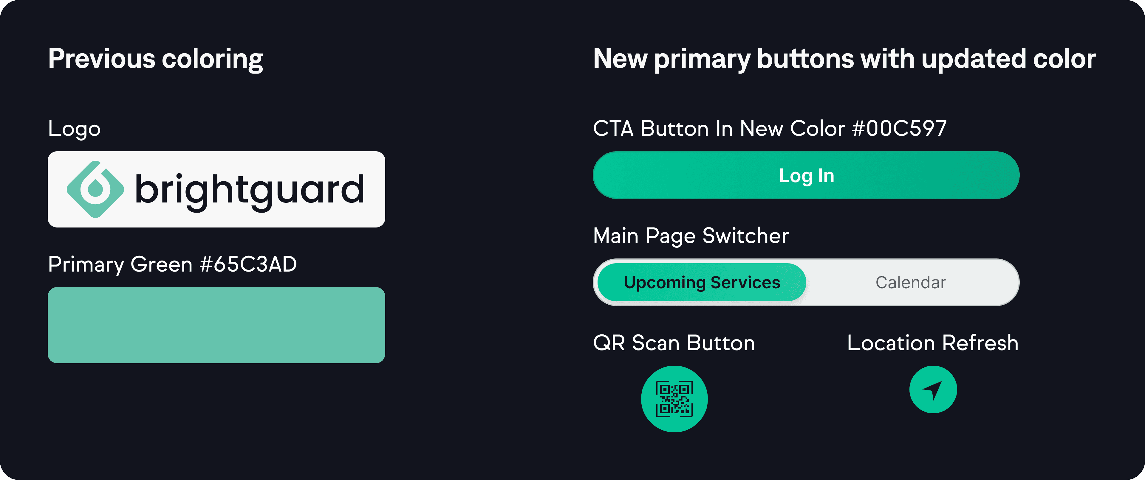
When designing the first round of high-fidelity drafts, I started to see that the font's readability could be an issue when seen repeatedly. I decided to implement the Google font 'Inter' to make it easy for our users as well as help with the speed of page rendering by using a web-based font:
Referencing my user interviews and low-fidelity sketches, I began designing my first round of high-fidelity screens to eventually be prototyped and tested.
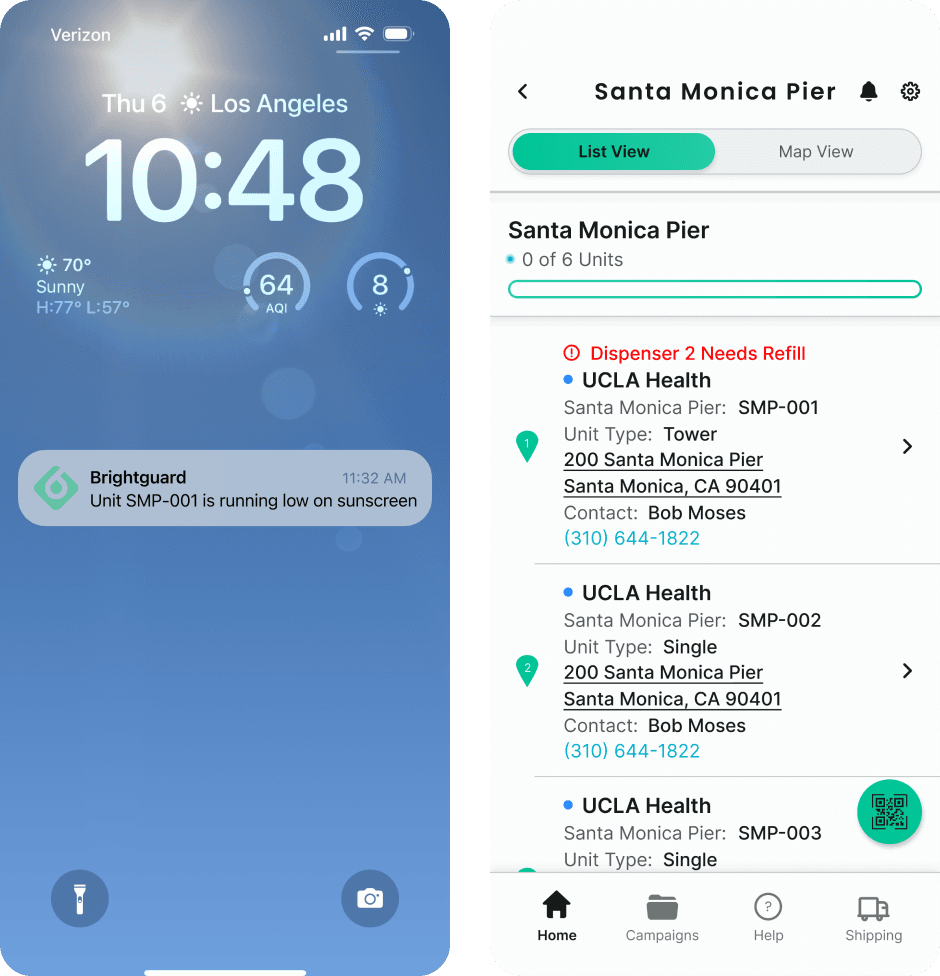
Home Dashboard

List View / Map View
Once our service attendant has selected which grouping of dispensers they are going to service they can view them in ‘List View’ or ‘Map View’. With easy access to both this should help them quickly find their next dispenser and complete their route efficiently.
Dispenser Access Through QR Code Scan
As I had discovered in my user interviews one previous part-time employee had the brilliant idea of having a QR code on the inside plates of the dispensers so you could scan it using the application to bring you right to that specific units service steps page. I wanted to give the owner the ability to see a simple prototyped version of that so I included it in my design.
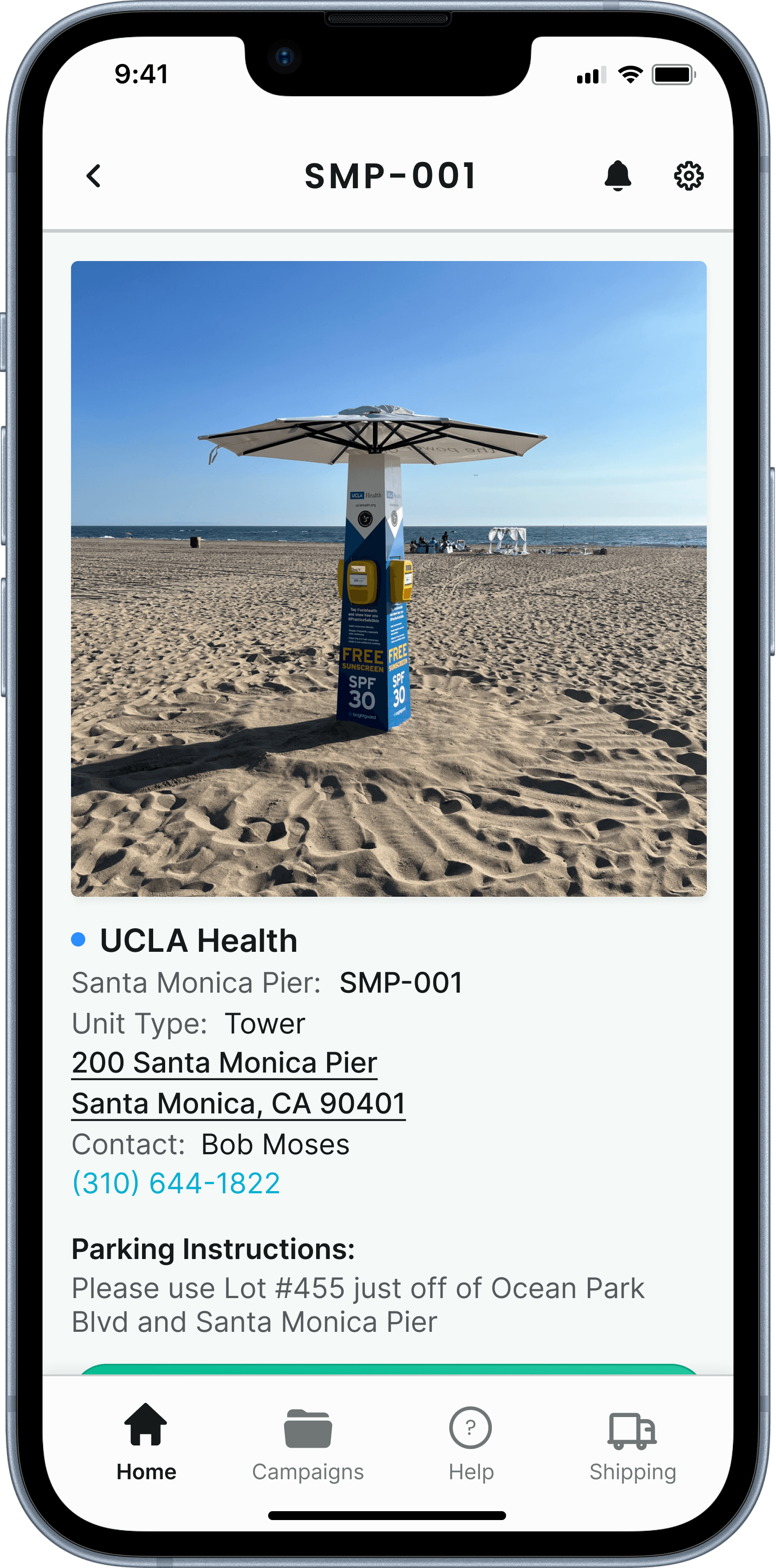
Individual Dispenser Page

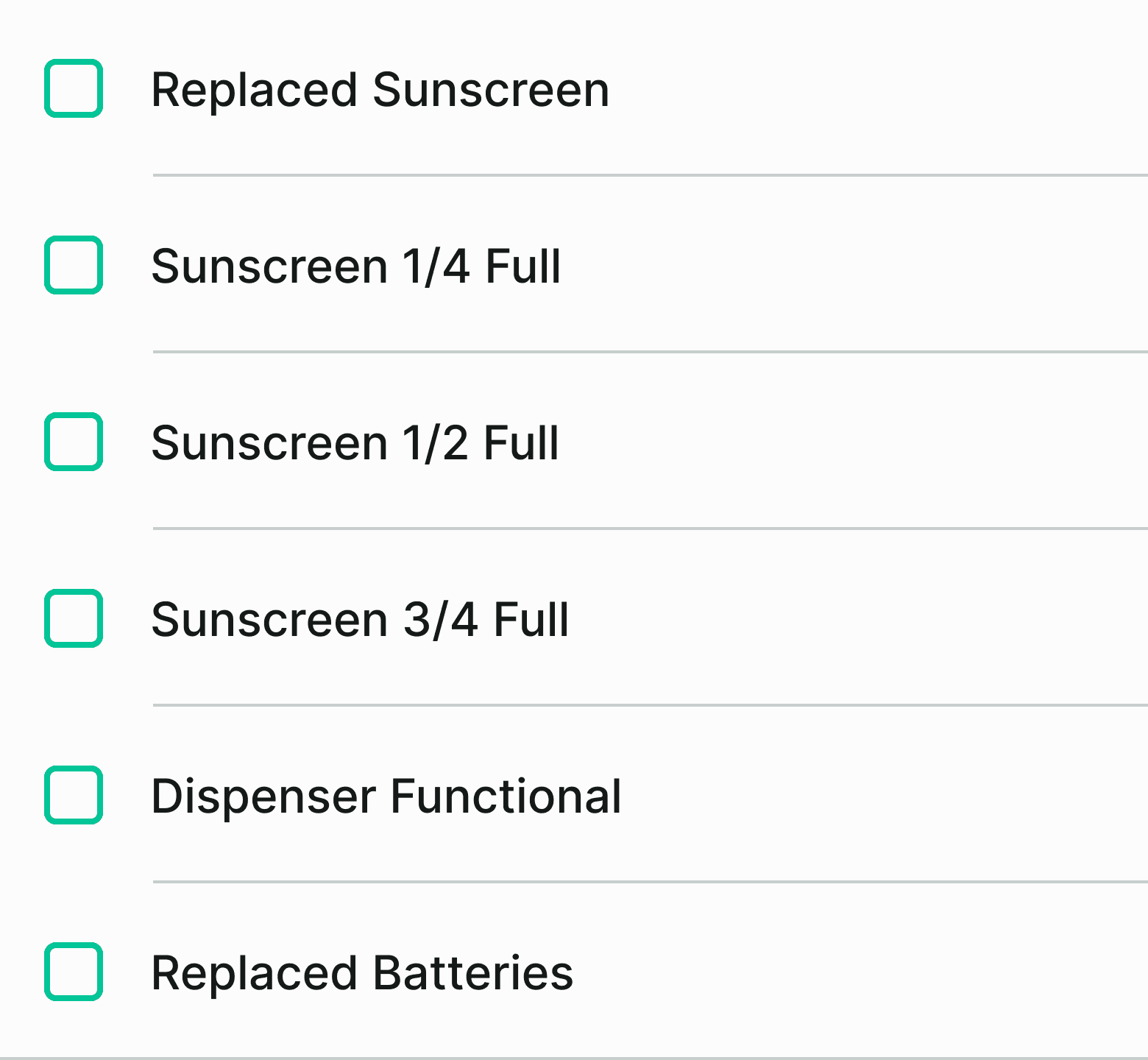
Service Steps Page to Completed Card
The step-by-step 'Service Steps' page takes our attendant through a simple checklist to service and refill (if needed) every dispenser on their list. Once completed their ‘List View’ updates automatically.
Assigned Campaigns Page

Manager Notifications
As one of our largest pain points was the inability of our manager to update his clients regularly and easily I wanted to also show a brief design of him getting an update from the app after service has been completed on a campaign or group of dispensers.
Service Attendant Notifications
During the initial conversation with our owner, he mentioned exploring the idea of equipping sunscreen dispensers with sensors to notify when they are running low. While it could be costly to implement, I committed to showcasing simple designs of the Service Attendant receiving notifications through our application.
Methods: Prototyping and moderated ‘click-through’ usability testing, affinity mapping
Goals: Analyze the ease and usability of the design and synthesize the results
After finishing the high-fidelity screens, I put together a ‘click through’ prototype in Figma to test with our owner and current and previous employees.

Service Attendant Perspective:
Complete the servicing of a dispenser without using the QR code to arrive at the unit
Complete the servicing of a dispenser by using the QR code to arrive at the unit
Manager Perspective:
Receive an update to share information with a client
Our owner and employees were also asked about certain UX copy and UI elements after going through the ‘click through’ prototype:
Is there other information you would want to see for any of the cards used (i.e. Campaign Cards)?
Is Service (i.e. Service Steps, Service Attendant) a good word to use UX-wise? How about unit vs dispenser?
In our service flow, has anything been missed? Open up discussion of how it could be laid out differently.
In our Admin flow, if you receive an update, what information would you like to see?
Affinity Mapping
I recorded each test and after it was all said and done I went back through each interview to gather up some key quotes and themes.

5 users were tested - our owner and four employees, three of whom had worked for Brightguard in the past and one who is currently working for Brightguard on a part-time basis.
Success Metrics, Task Completion:
100 % of user were able to complete the tasks with zero issues. When asked to rate the difficulty of the tasks on a scale of 1-10 (10 being the most difficult) every task was rated at a 1 by all users.
Success Metrics, Average Time on Task:
Average time on the first task flow was 2 minutes, 15 seconds.
Average time on the second task flow (using the QR code) was 1 minute 10 seconds.
Average time for our last task flow was very quick (averaging under a minute) as it was more of a demonstration of how the app would look if our manager got a notification.
Success Metrics, Overall Aesthetic And Visuals:
Each user felt good about the overall visual theme, color and aesthetic which was in line with the Brightguard brand. Further discussion of visual changes in key takeaways and iterations.
Owner and users loved the application and were excited to share it with current clients.
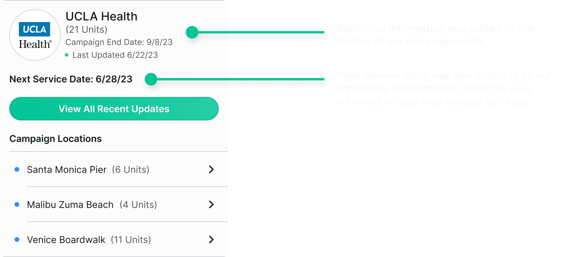
Owner particularly liked the map view and discussed adding a client log-in view with both list and map view options.
Users suggested improvements, such as showing multiple campaigns in one workday, displaying campaign information on dispenser cards, and optimizing the ‘Damaged/Inoperative’ and placement of QR buttons.
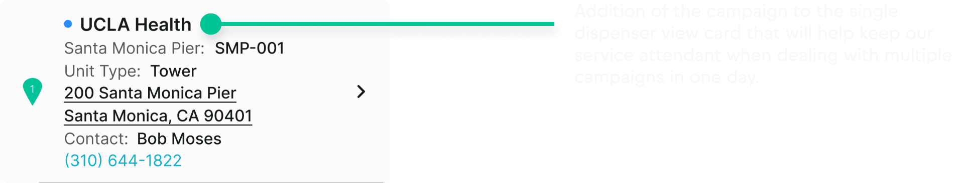
Two users felt that the campaign cards did not have enough ‘front-facing’ information that they would want to see on the top of the card.
All of our servicing employees felt that the multiple placements of our ‘Damaged / Inoperative’ button under the single dispenser view as well as the service steps seemed redundant and we discussed having it only in the service steps area. The same goes for the QR button under the single dispenser view, so I noted it down for iterations.
One user mentioned leaving dispensers with ¼ full bags, leading to the agreement to add this option in the service steps.
All users agreed that 'before photos' were unnecessary for service steps, leading to potential time savings.
Methods: Iterate and review
Goals: Take key findings and work on design iterations to share with our owner
Home Dashboard Cards Before And After
Some minor but important changes to our single dispenser cards that our user sees on the home dashboard and under ‘List View’ and ‘Map View’.
Single Dispenser Card Version 1

Single Dispenser Card Version 2
Todays Services Cards Before And After
Also ome minor changes to our services cards that appear for our attendant on the home dashboard.
Todays Services Card Version 1
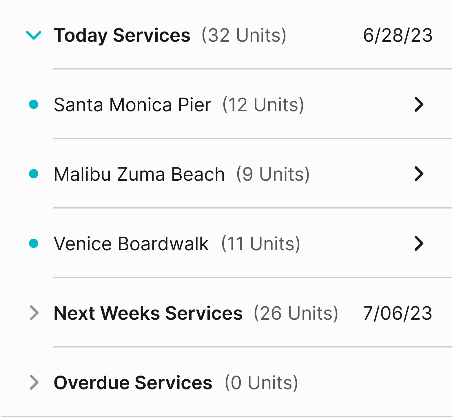
Todays Services Card Version 2 After Testing

Campaign Cards Before And After
Minor changes were also done to our campaign cards to show more immediate information to our user.
Campaign Card Version 1

Campaign Card Version 2 After Testing
Removal Of ‘Damaged / Inoperative And QR Button In Single Dispenser View
As discussed in the takeaways from testing, there was no need to have our 'Damaged / Inoperative button in two places so it was removed when viewing a single dispenser. I also removed the floating QR scanner button as there would be no need for a user to use once they had arrived on this page.
Single Dispenser View Version 1 With Buttons
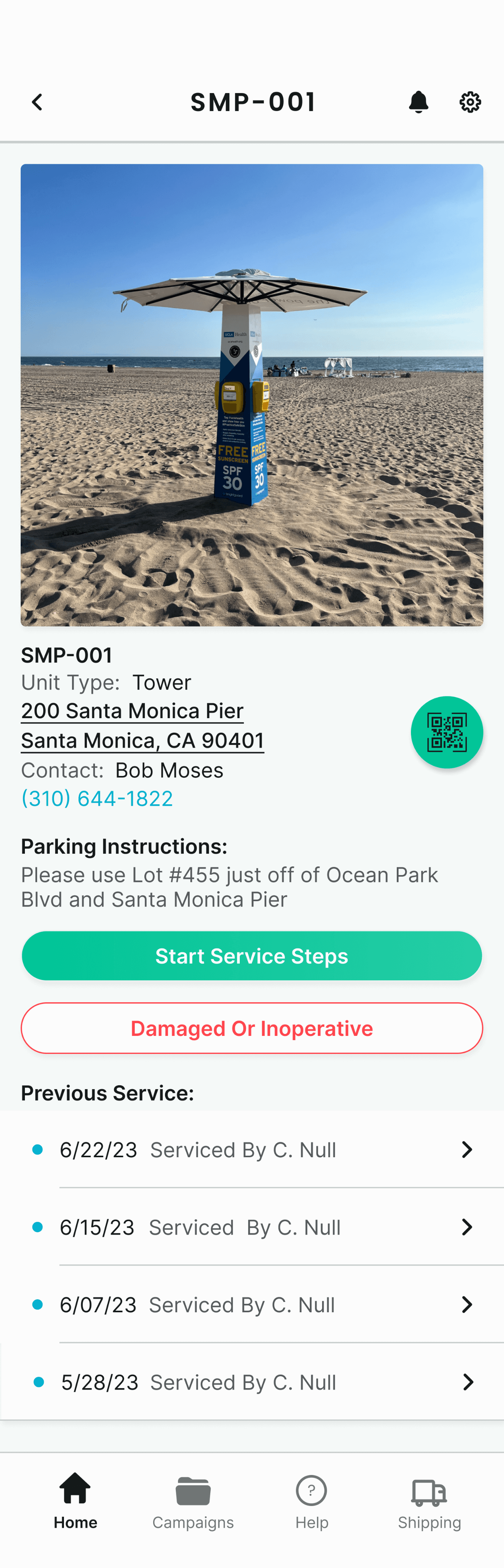
Single Dispenser View Version 2 With Buttons Removed
Addition ‘1/4 Full Box’ To Service Steps
Service Steps Card Version 1

Service Steps Card Version 2
The Brightguard App
Throughout this project, I experienced a lot of growth and learning. It was truly fulfilling to tackle real challenges faced by a genuine company, crafting solutions within tight timelines. The owner's deep understanding of the business and willingness to collaborate on ideas and issues proved immensely beneficial. The owner's interest in sharing my designs with clients and engaging in further discussions is genuinely validating. It's my favorite project to date.
Next Steps
Prioritize the development of a 'client log-in view' for owner feedback and discussion.
Next design focus should be on the FAQ/Help section based on owner and user feedback.
Consider user research and low-fidelity design for the shipping section based on user testing insights.
Engage developers in discussions to refine and enhance the overall Brightguard application work and flow.
Netflix
Putting the power of search back in the hands of the user.

Community Collect
Helping those who are dedicated to helping others.