

Role: Researcher and Product Developer
Tools: Figma, Figjam and Whimsical
Skills: User research and synthesis, sketching, wire-framing, prototyping and testing
Timeline: 2 weeks
Methods: User interviews, user surveys and competitive analysis of other non-profit CRM dashboards on the market
Goals: Gain insight into the needs and pain points of people who work for these organizations and understand the features and heuristics of already available platforms
Food insecurity is an increasingly growing problem year after year. According to the USDA, more than 34 million people, including 9 million children in the United States, are food insecure. From 2021 to 2022, the number of needy families jumped by 5%. Many families regularly visit food pantries each month to get the food they need to survive and basic household medical supplies to keep them healthy.
Many of these organizations rely on volunteers every week to keep up with the demand of raising donations, organizing events, and managing the inventory. That process can be time-consuming and is generally spread out over multiple spreadsheets and multiple applications. All of this takes away from what our volunteers are really there to do, help people.
With my hypothesis of a dedicated CRM for food pantries in mind as a solution, I wanted to start by exploring and analyzing numerous non-profit/CRM dashboards available in the market. I compiled a comprehensive review of the top three contenders.

A Cloud based CRM for managing non-profits
Strengths
Highly recognizable brand name with proven track record.
Users are able to manage contacts by volunteering efforts and by donations made.
Users are able to make graphs and reports and easily share with their team.
Users can manage tasks and ‘to do’s’ very easily by event or contact.
Highly detailed reporting of communication with contacts can be made under each contact card section.
Donations dashboard is fully customizable by what metrics you want to see.
Membership program options in terms of categorizing contacts by level of ‘activity’ or donations.
Contact cards show volunteer activity in chronological order but it’s also filterable.
Weaknesses
So many features that might be overly complicated for more simple non-profits that just need to manage basic donations / events and volunteers
A Cloud based CRM for managing non-profits.
Strengths
Detailed events hosting that can generate emails and digital sign up forms that make it easier for you to get volunteers to help you at events.
Donors can do one-click donations with all their information saved to make it easy to donate again.
Users can easily see e-mail metric performance from marketing emails.
Workflow automation for how often to contact prospects / volunteers.
Highly detailed contact cards for volunteers.
Users can set membership program options for donors.
Contact cards show volunteer activity (and financial activity) in chronological order but it’s also filterable.
Weaknesses
Similar to Salesforce, it is very full scale for a larger non-profit and might be too much for a smaller / simpler group.

Free online donation management, event management and CRM for a non-profit or any type of fundraising.
Strengths
Extremely easy to use with a very modern UI.
Users can manage a non-profit but also do any type of fund-raising or event management.
Customizable forms for donations / events / campaigns etc.
Anyone can sign up, no need for 503(c) non-profit.
Has almost everything you need to manage your non-profit / fundraiser / event.
Also has an auction hosting section
Weaknesses
Potentially not a serious enough branding for an event that is more based around helping people in need or people who are struggling / need food, etc.
The competitive analysis revealed two key takeaways worth highlighting:
While examining these dashboards, it became evident that the primary emphasis lay in managing donors and donations. There was a noticeable lack of options tailored specifically to address the unique requirements of food pantry donations, encompassing inventory management and volunteer and event coordination.
Many of the CRMs are very ‘full-scale’ and have a UI that is just ‘too much’ for some people who are just there to volunteer on a part-time basis.
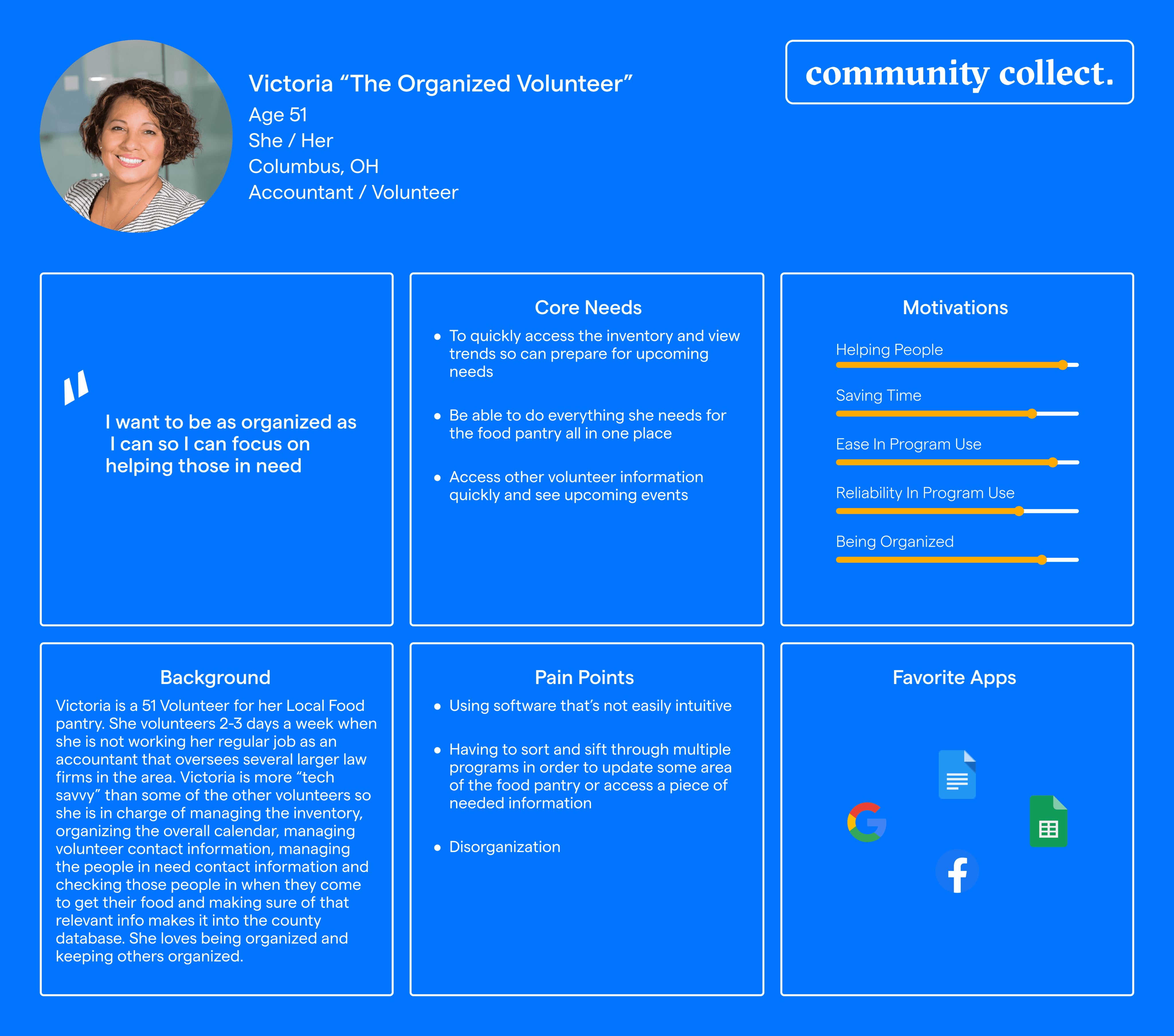
I conducted interviews with five users, ranging in age from 42 to 75, who generously volunteer their time at a food pantry affiliated with a larger network in Columbus, Ohio. Among the interviewees, one held a managerial role, and he granted approval to create a survey for other volunteers who might be interested in assisting. This was my first time conducting a survey and utilizing Google Forms, which proved to be an effortless and insightful process, helping me gather valuable responses and view the results efficiently.
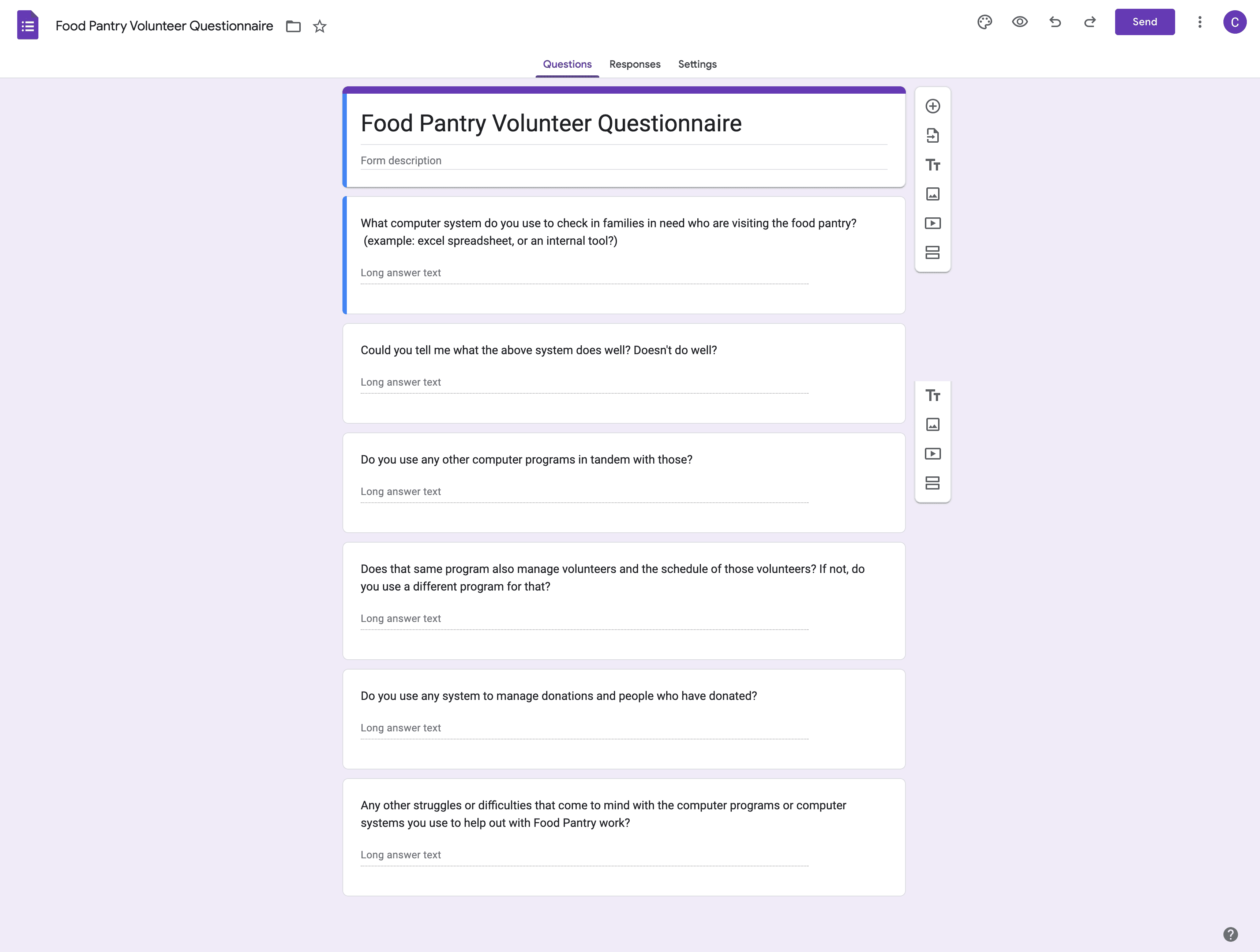
After doing the interviews and receiving the surveys I synthesized the data using affinity mapping.
User Process Understanding From Interviews And Surveys
Speaking with the ‘on-the-ground’ volunteers about their day to process was the most revealing. Below are the day-to-day actions they manage:
Managing the overall food inventory being kept in multiple warehouses.
Responsible for reporting what items are running low to raise more money or donations of those items.
Keeping track of all monetary and food / supply-based donations.
Scheduling and managing events and drives.
Scheduling and managing volunteers.
Checking-in patrons or families in need when they come to get their food and supplies. The small amount of information they collect is also sent to the county for further tracking of food insecurity and unhoused families in the area.
Volunteers are using multiple programs (excel, Sign - Up genius, QuickBooks) to keep track of the inventory, signing in patrons who are coming to receive food/supplies, and aren’t using any program to measure metrics of what is needed for upcoming donation drives. Multiple users expressed a need to have everything in one place.
When gathering data for monetary donations needed to buy more food and supplies (especially medical supplies), they have to guess what could be needed when talking with potential donors. No real easy-to-gather metrics are available for donation drives.
Food waste was an issue for every user of their Food Pantry. They have perishable items that they do give to patrons, but they end up throwing away about 15 percent of the perishable items.
Some of the pantries receive pallets of food/supplies from larger purchases or donations. They end up counting it / logging it by hand, so even though no one brought this up, I think there is an opportunity there for a digital solution.
Most volunteer management is done by phone with little use of a program to manage them. Schedules are kept and updated on spreadsheets by a handful of users. Some integration into one system could also be an opportunity here.
Every user had hand counting/logging in food/supplies as a pain point.
Helping individual families is the most important thing to each volunteer. Getting them food and supplies they need to survive comes first and foremost.
Not every person working for the food pantry was the most computer savvy, so unintuitive computer programs were a pain point for those select few.
With the competitive analysis not showing much in terms of a CRM specific to Food Pantry management, user interviews with key themes, and my user persona in hand, I synthesized several POVs into two definitive HMWs:
HMW: How might we make it easier for volunteers to spend more time on helping families in need and less time on managing the food pantry?
HMW: How might we make it simple for volunteers to access donation metrics when working on larger fund raising drives?
Design a comprehensive dashboard for Food Pantry Non-Profits to manage volunteers, donations and inventory, events, and drives and be able to check-in patrons and pull quick reports to help with donation drives.
Methods: Site Mapping and Task Flows
Goals: Start first versions of a site map and task flows to get a better overall perspective of the dashboard
I moved my goal forward by starting with a feature road map and then moving on to working on a sitemap.

Keeping my user's process and pain points in mind, I decided to focus the task flows of the dashboard on the following (please note the dashboard’s design intends to be modular so there will be multiple ways a user can access each of these flows):
Methods: Low fidelity wire-framing, company branding and high fidelity mock-ups
Goals: Quick ideation of key screens for our task flows and a first version of high fidelity screens
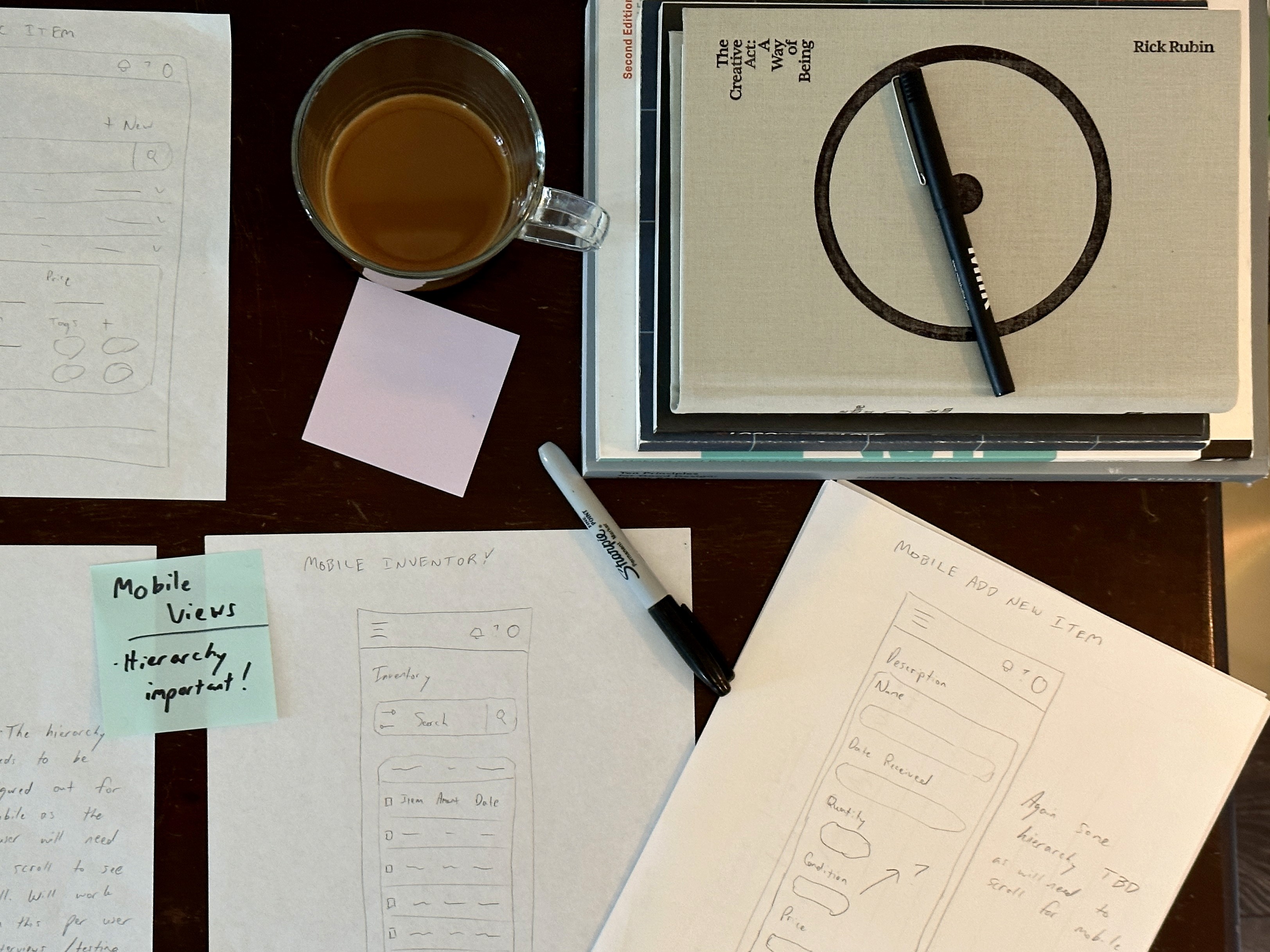
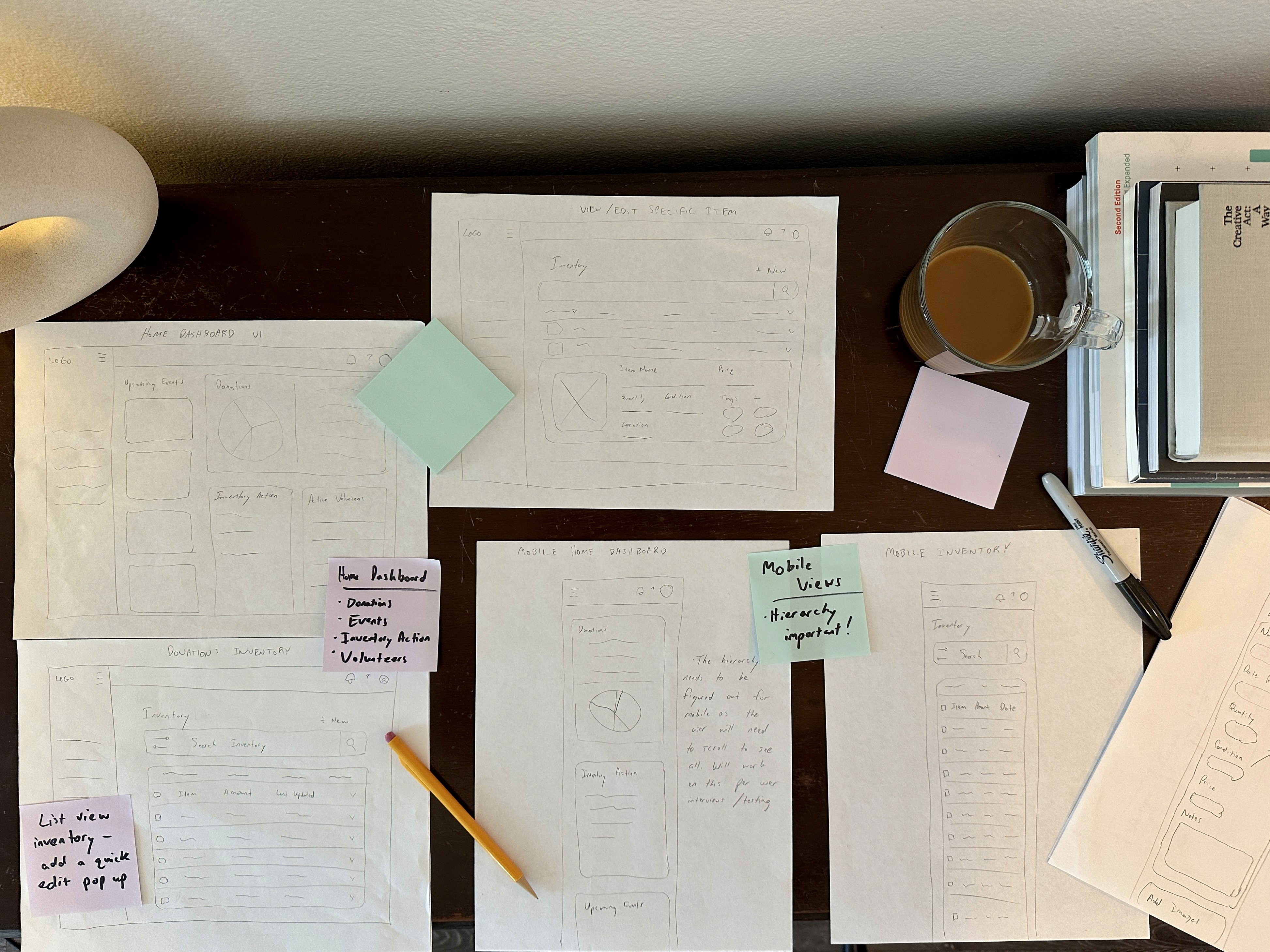
Afterwards, I proceeded to create several low-fidelity layout concepts for the dashboard design. It was essential for this application to embrace a responsive design, considering user interviews highlighted the demand for accessibility from anywhere. Additionally, I incorporated a 'scanning an SKU' function specifically designed for mobile devices, ensuring users an easier way to count in larger donations of food.
Screens And Iterations Sketched In Both Desktop And Mobile:
Home Dashboard
Donations Inventory
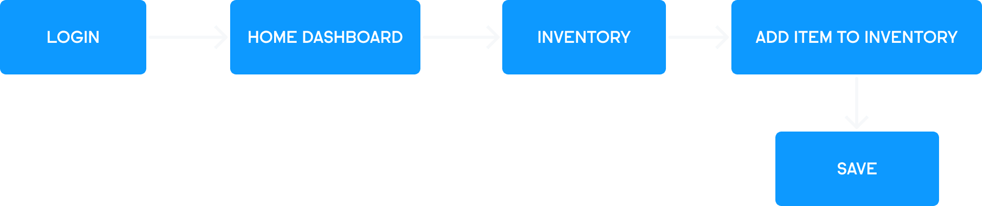
Add New Items To Inventory
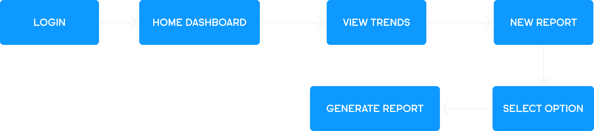
Trends Dashboard
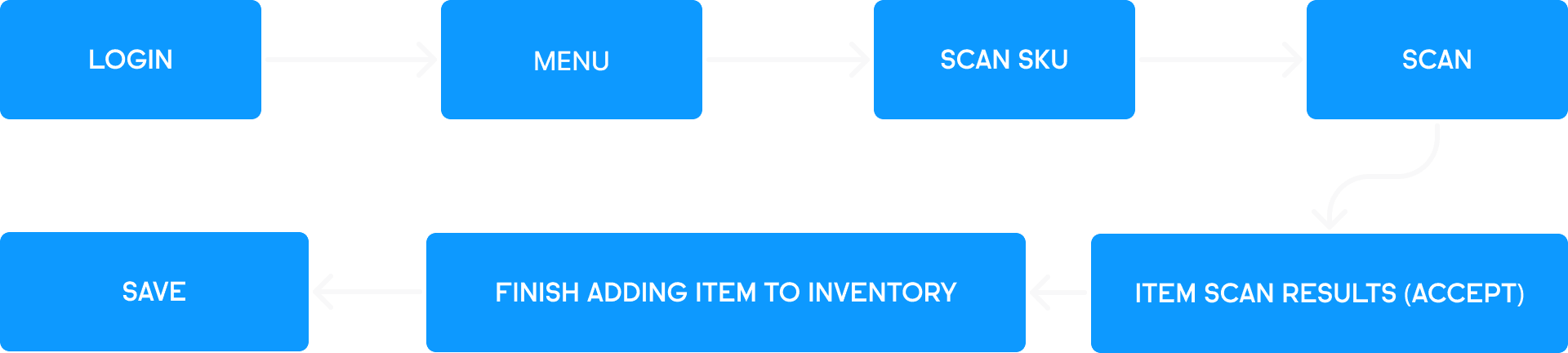
SKU Scanning (Mobile Only)
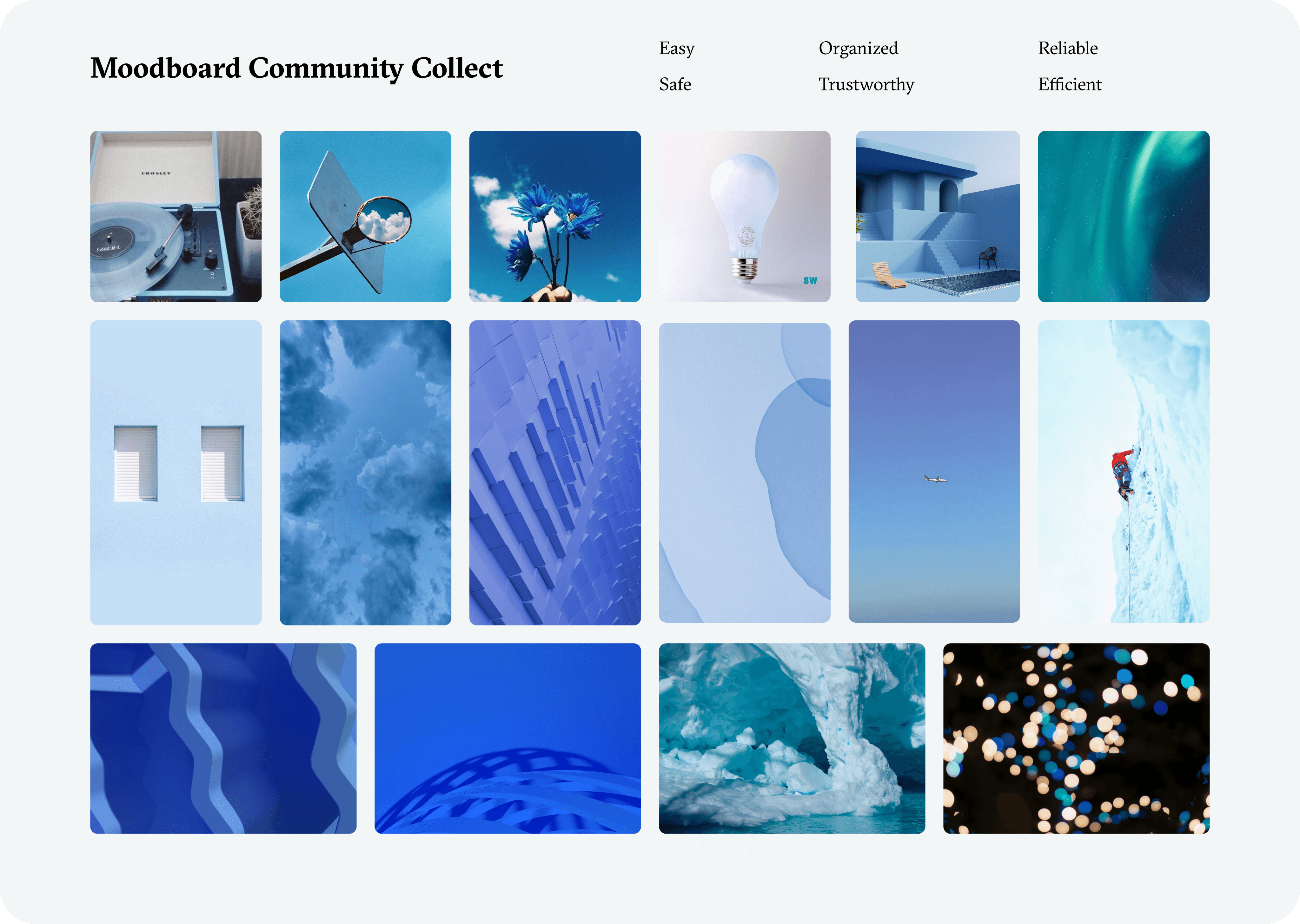
After brainstorming several different name ideas, I decided to name the application ‘Community Collect’. Being that this project is focused on making the jobs of these volunteers easier, I felt that the following words were a good starting point for making brand decisions:
Brand Words:
Reliable
Trustworthy
Easy
Safe
Organized
Efficient
Moodboard
Keeping the brand words in mind I also made a moodboard based around blues and soft blues.
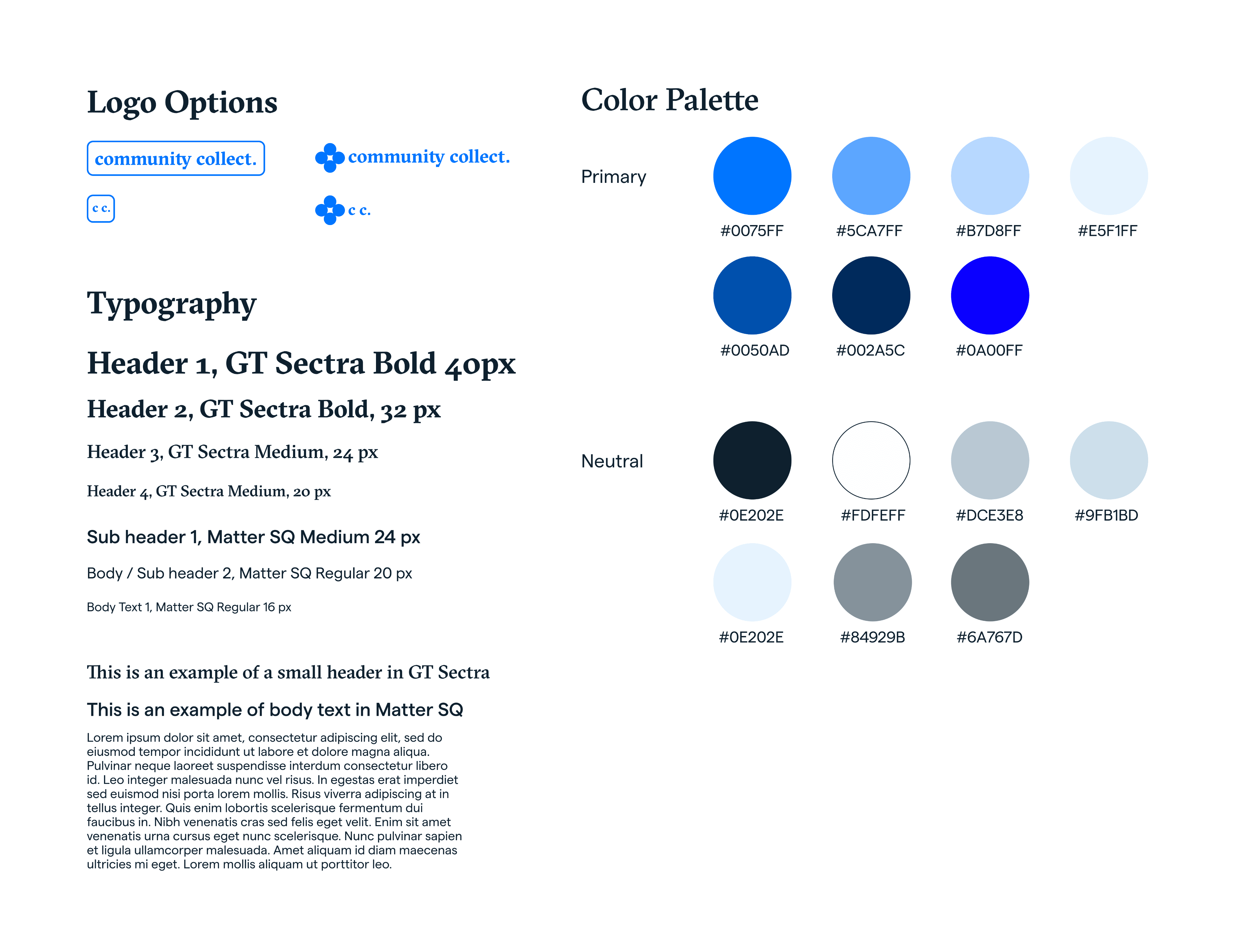
Style Tile
With my key words and mood board in mind I began to ideate on colors/logos/typography as a jumping-off point to get to designing:
With an established brand together, I moved on to designing key screens that related to our user task flows:
Desktop Home Dashboard
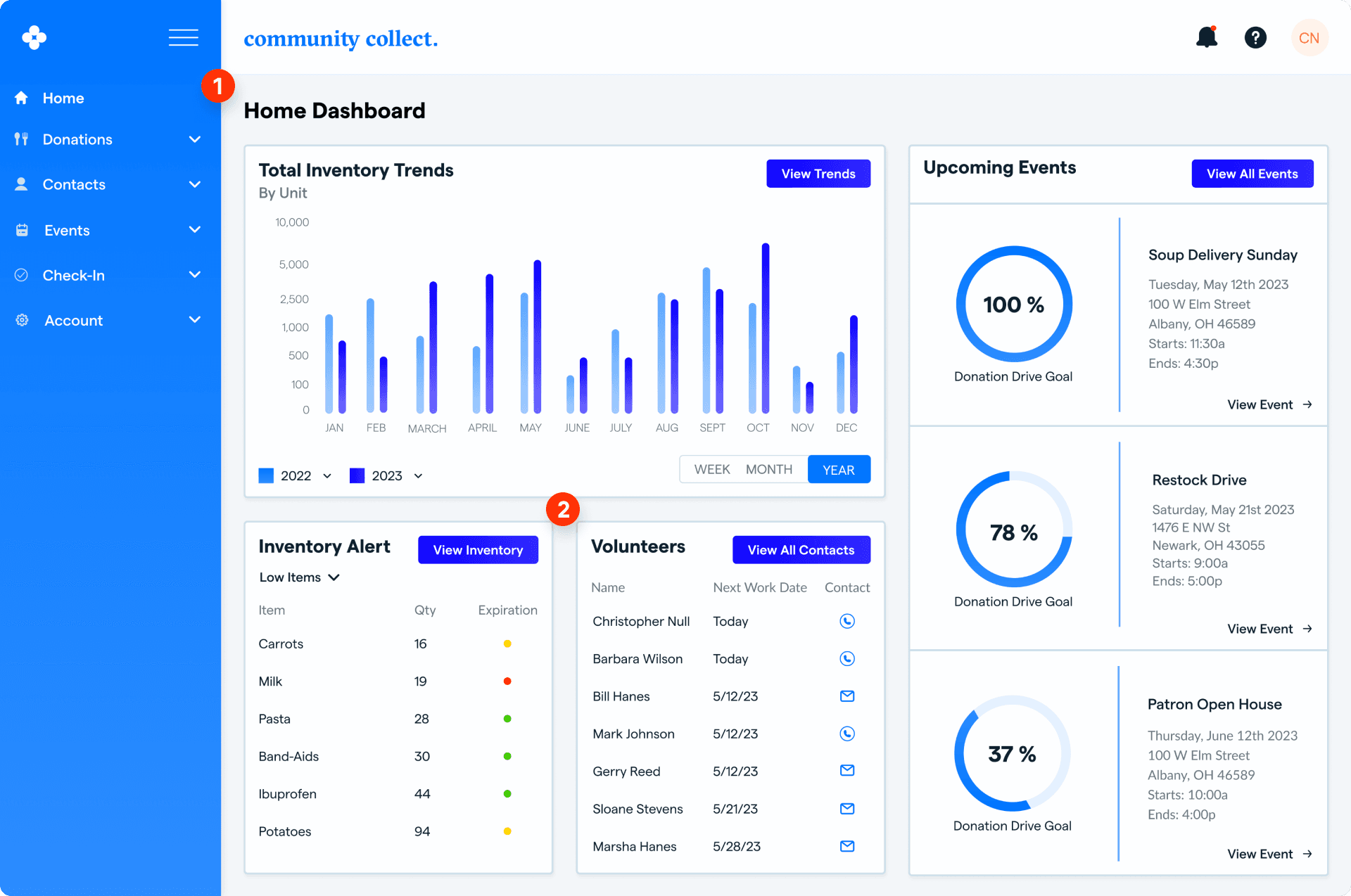
Collapsible side navigation gives user easy access to all areas of the dashboard.
Upon accessing the application, users are greeted with key sections that include total inventory trends, inventory alert, volunteers, and upcoming events. Before finalizing these designs, we experimented with various card explorations, aiming to find the most effective and visually appealing options.
Desktop Home Dashboard Card Explorations
Before settling on this first version of the home dashboard design (it’s not the final version, still more changes to come!) I did go through some iterations of card explorations.
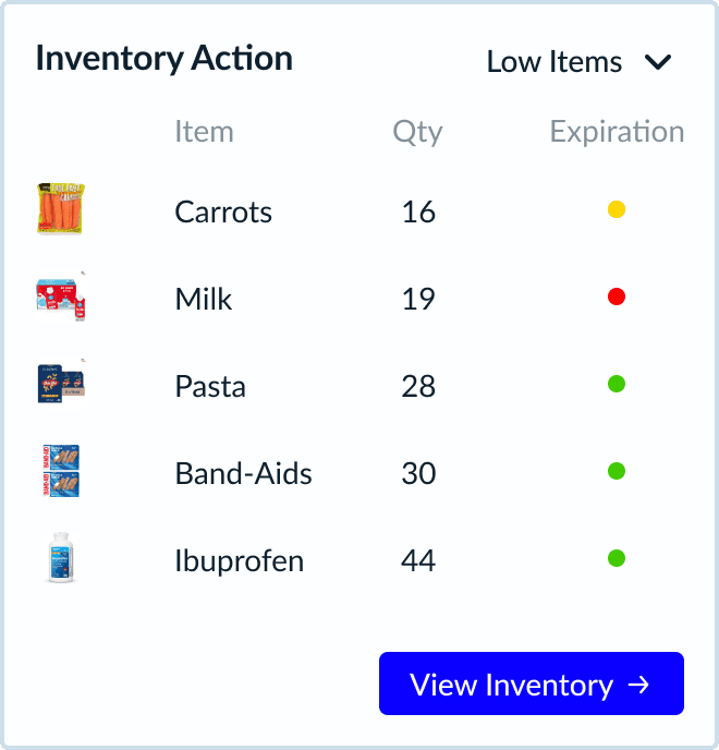
Inventory Action Card Exploration
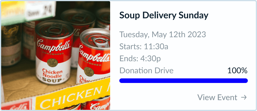
Event Card Exploration
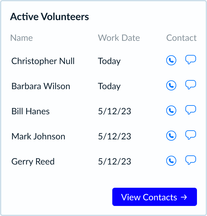
Volunteers Card Exploration
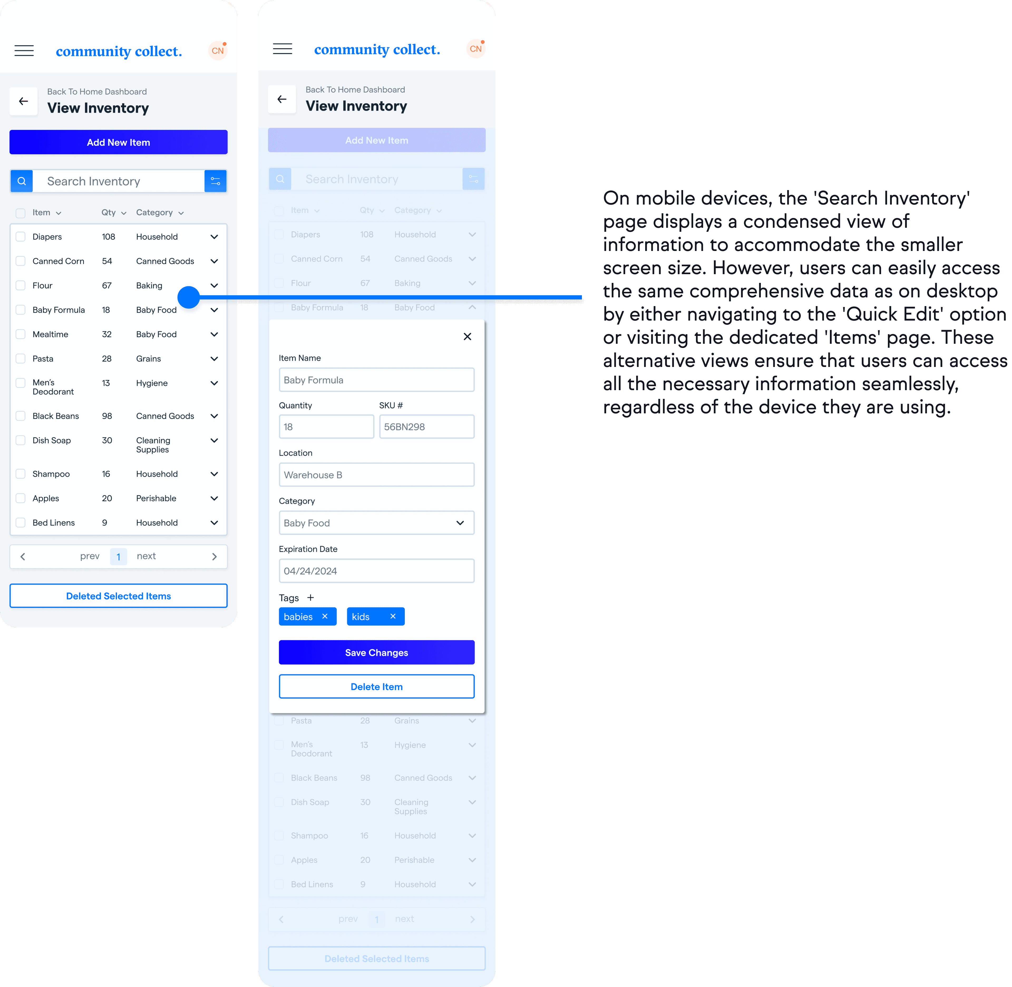
Desktop Inventory Search And ‘Quick Edit’
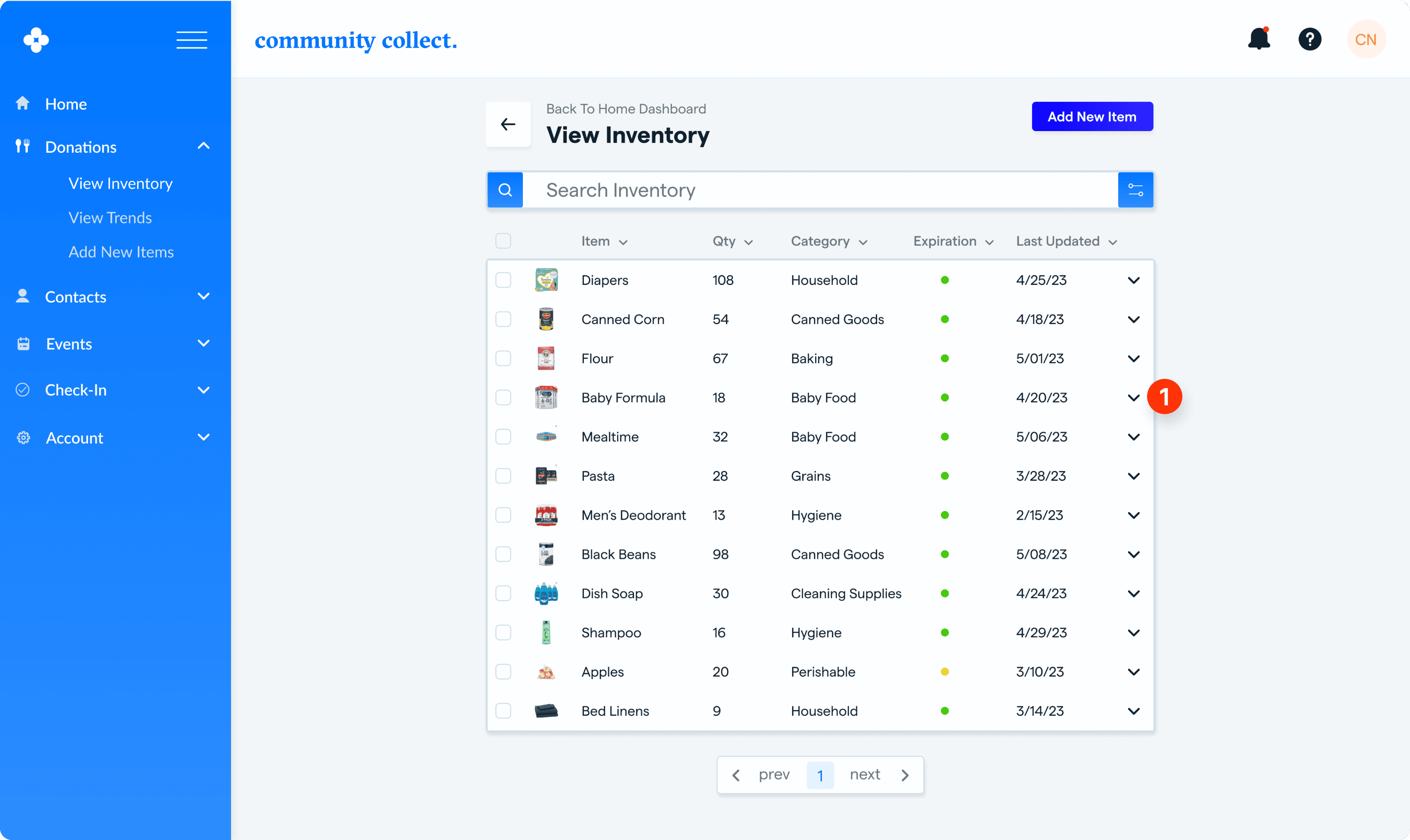
I thought a good feature was a ‘quick edit’ of an item under the search inventory page. The user would open up a specific item by selecting the carrot here (icon eventually changes in final version) and ‘quick edit’ would look like the below screen.
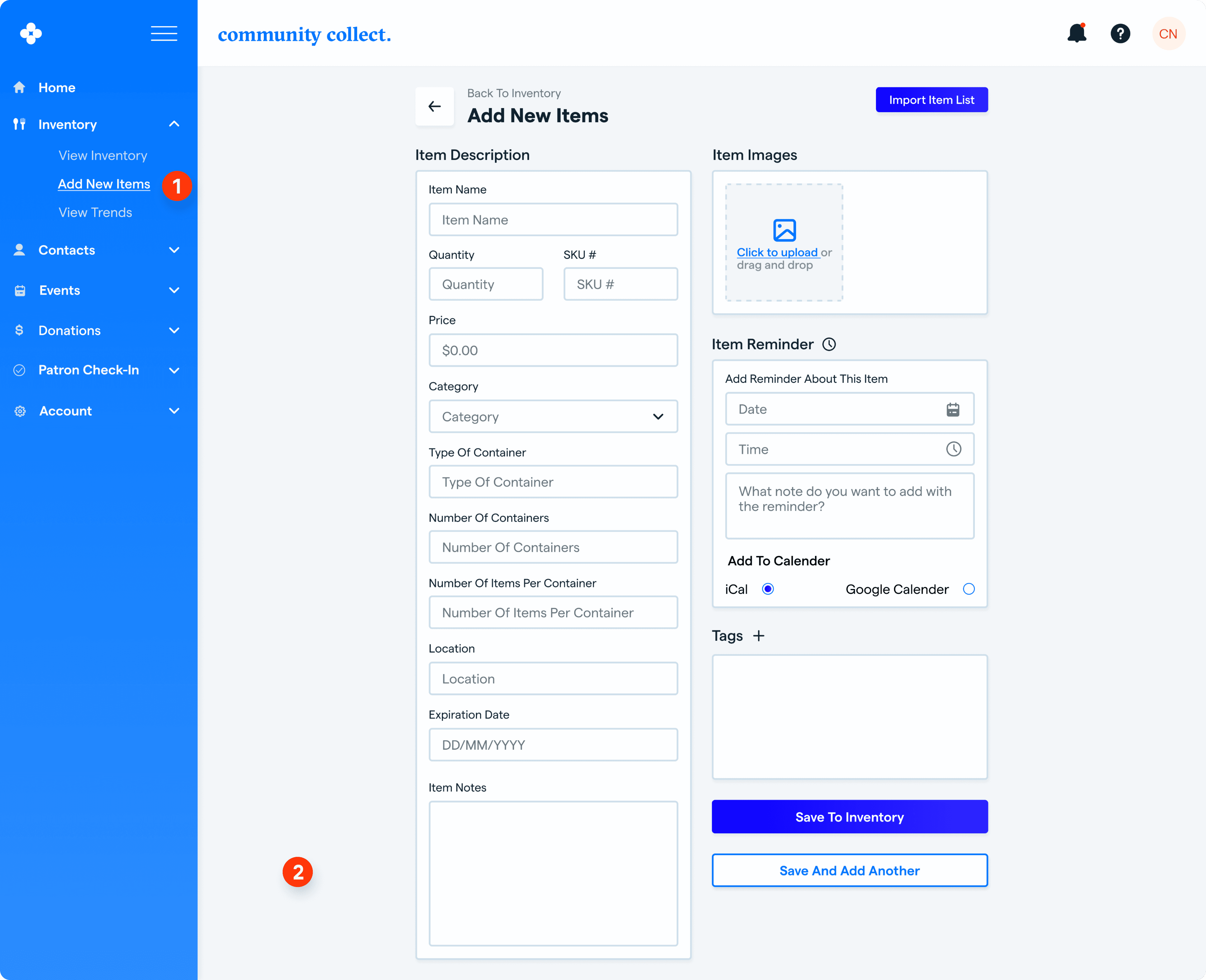
Desktop Add New Item To Inventory
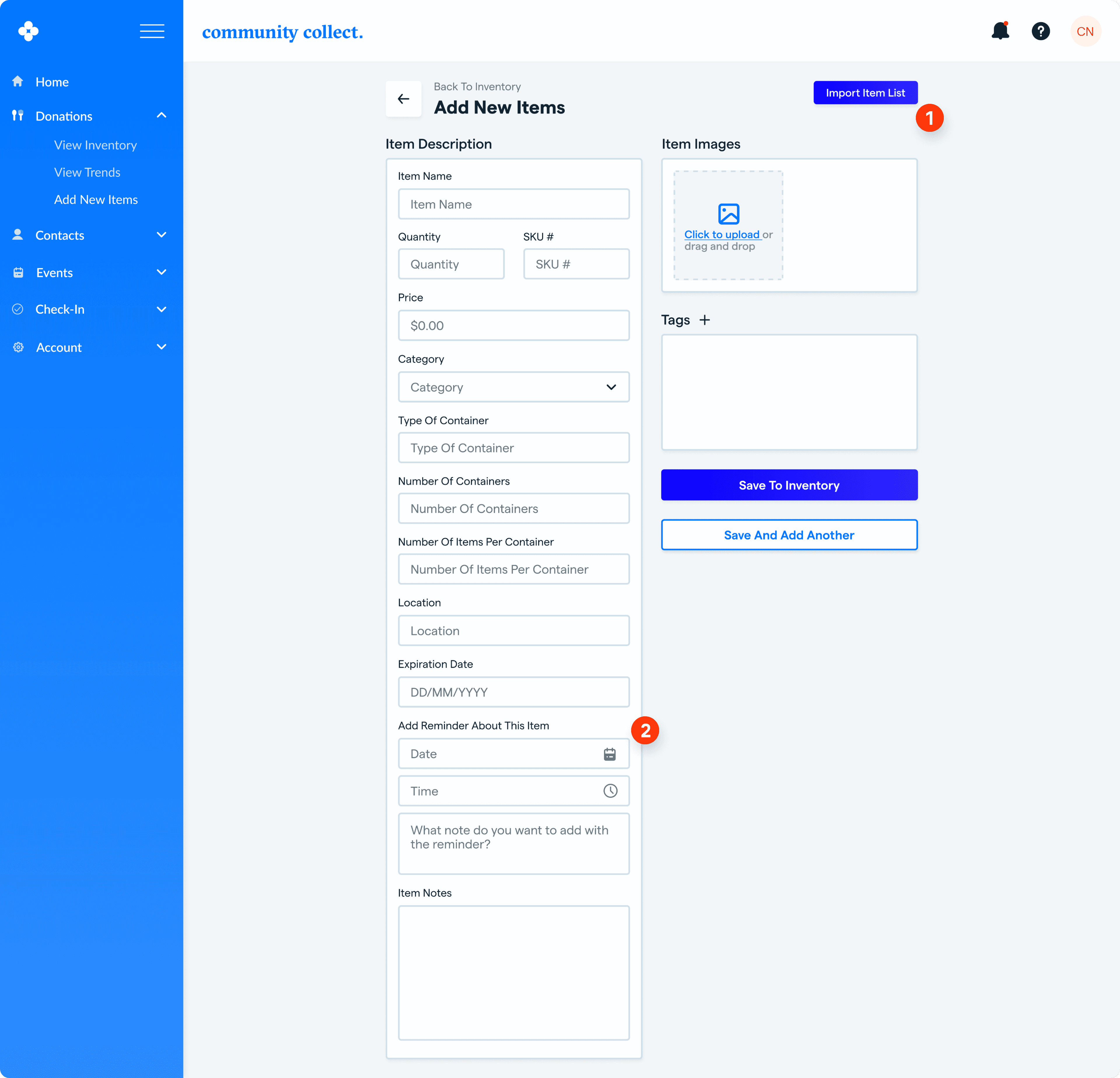

Option for user to import an ‘item list’.
Option for user to set a reminder about this item in case they need to purchase again or reach out to a specific donor about this item.
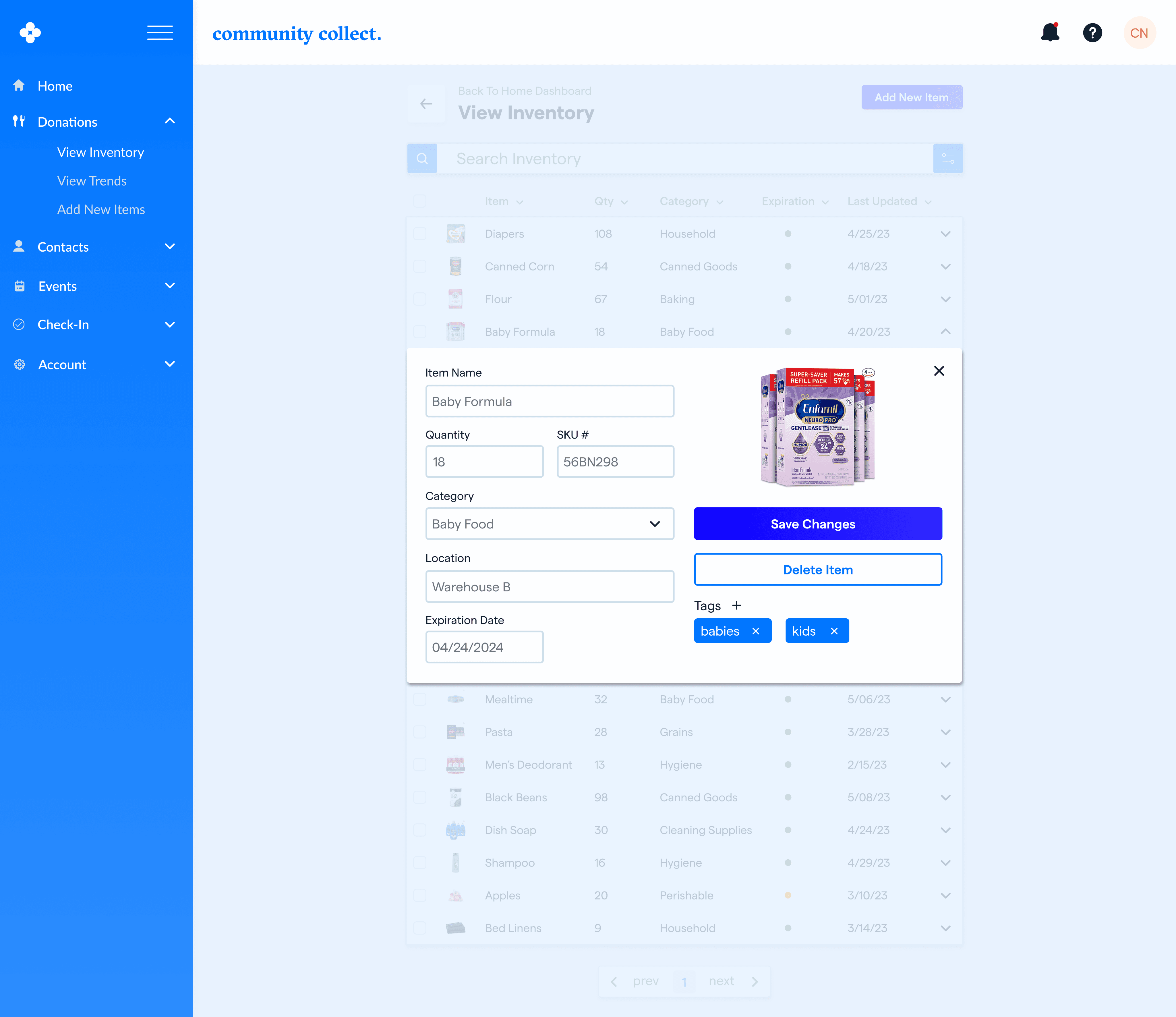
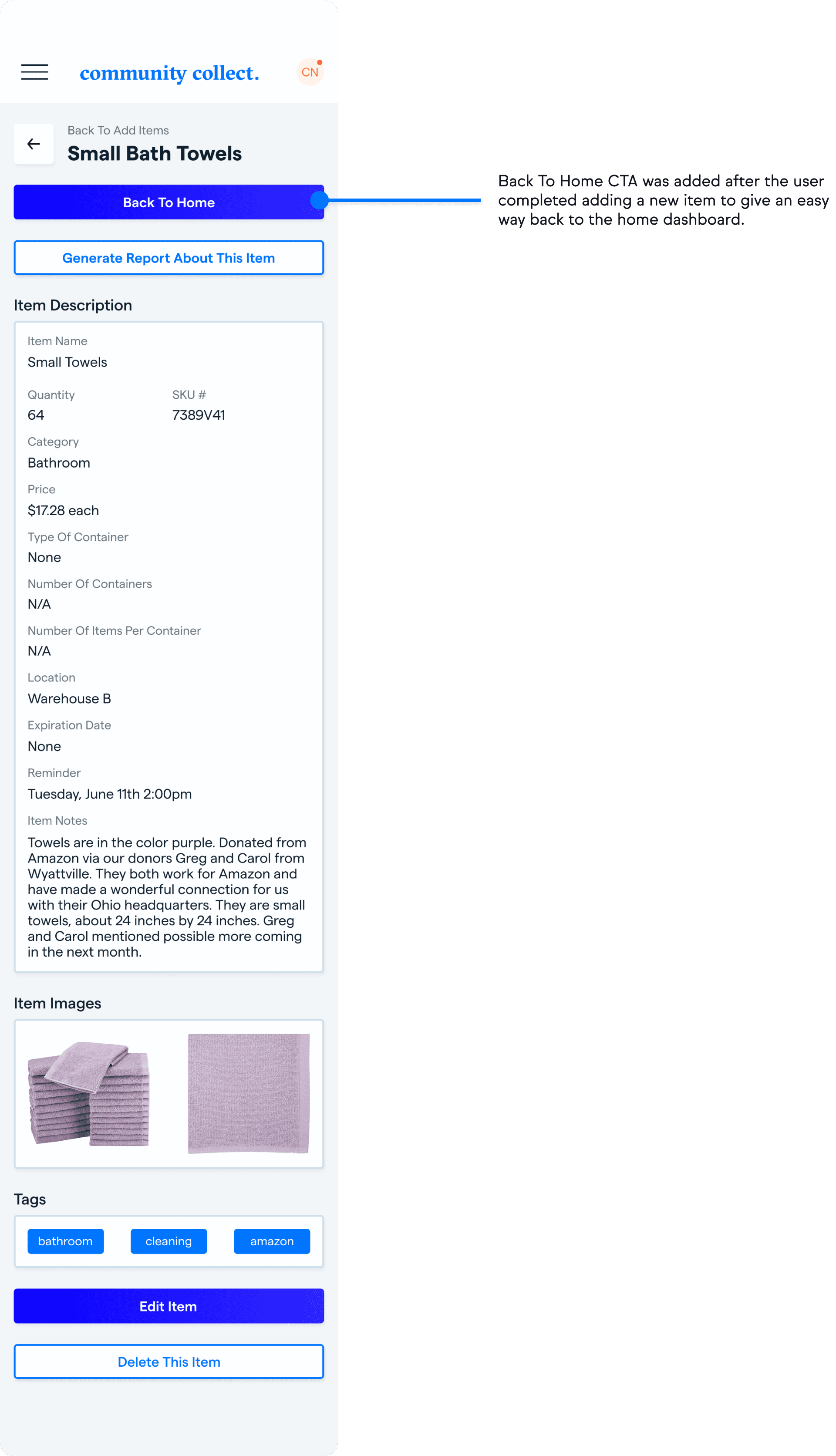
A version of what an item page looks like once finished and/or selected from the search inventory. The user has the option to generate a custom report about this item.
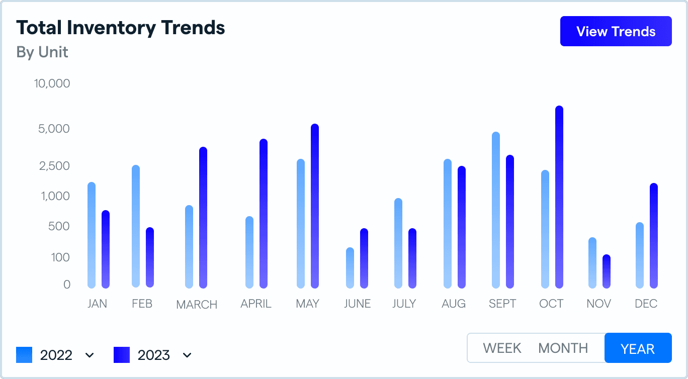
Desktop Inventory Trends
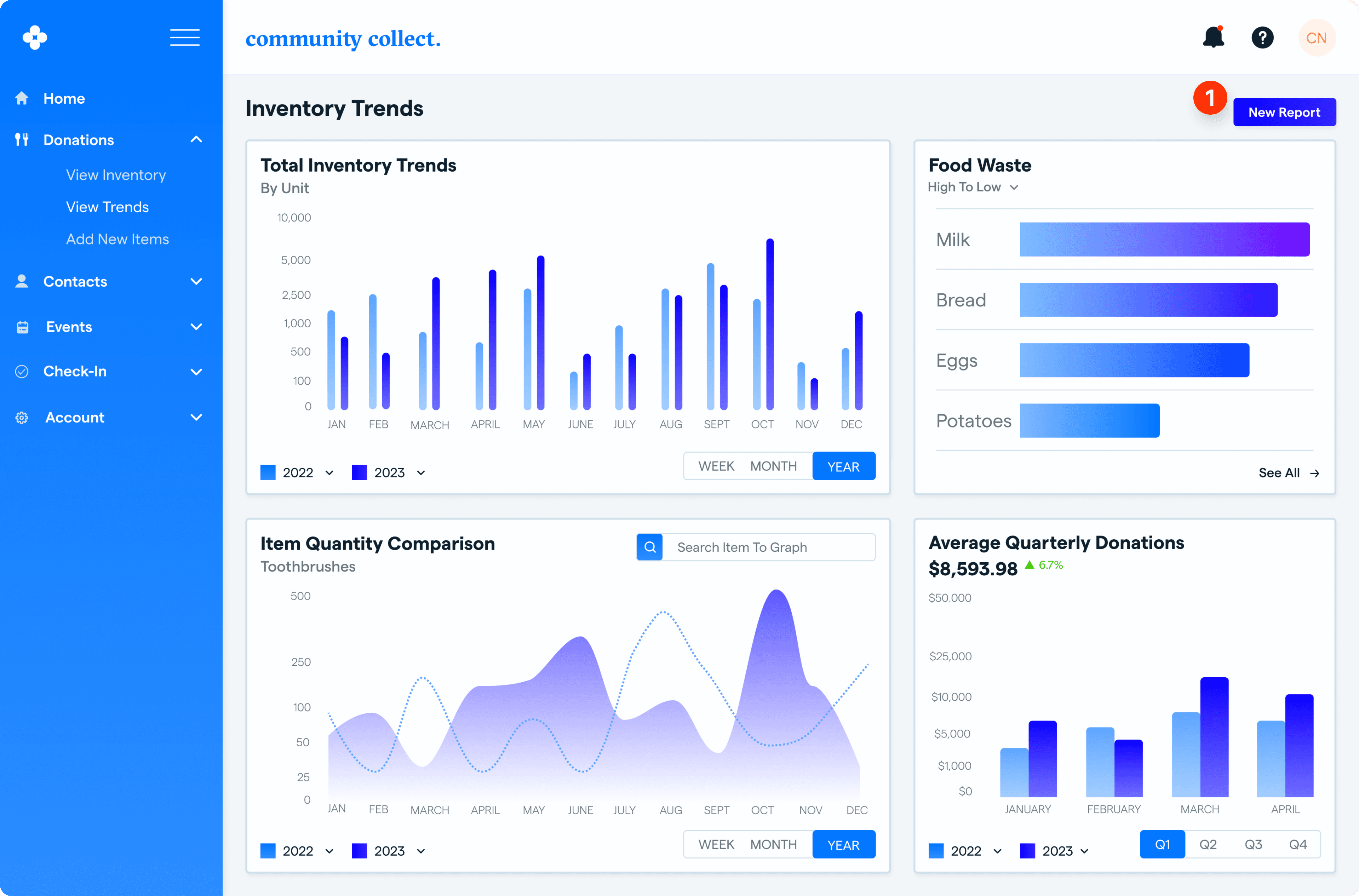
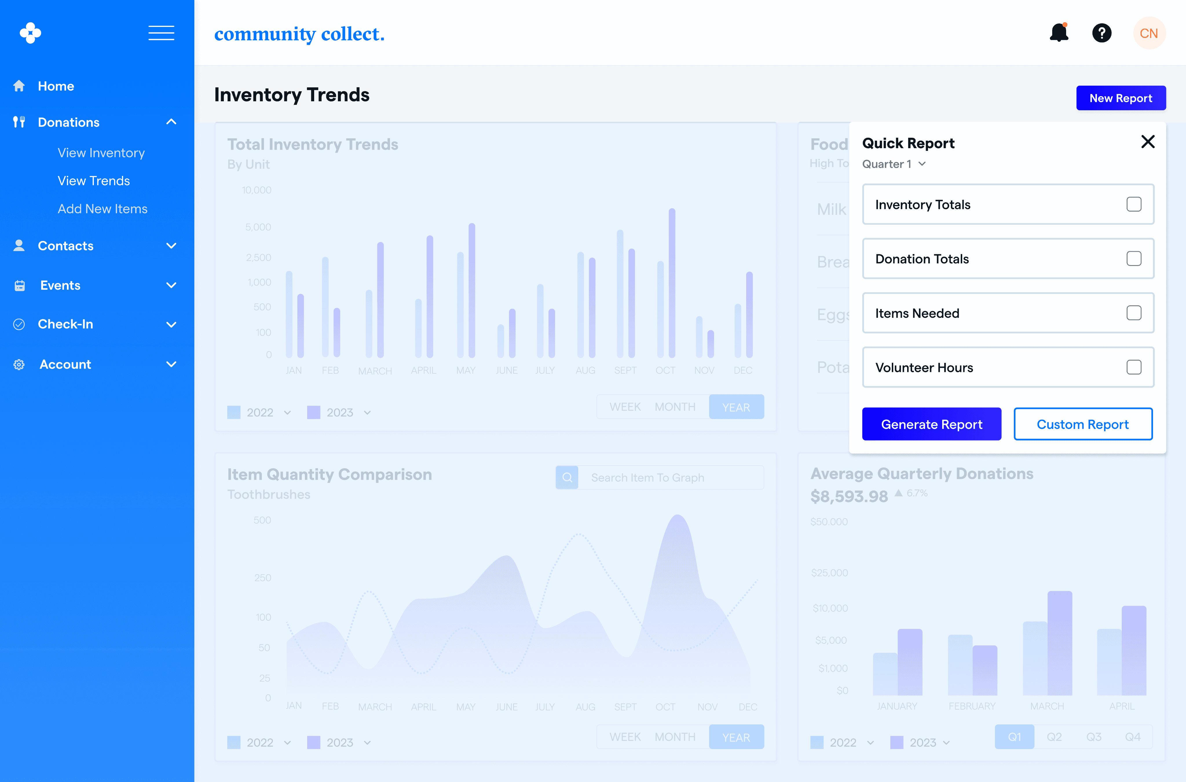
Within the application, users can access a comprehensive overview of various trends in the food pantry inventory they have set up. This feature empowers users to gather essential insights into inventory fluctuations, aiding them in effectively planning donation drives and generating comprehensive reports for reporting purposes. The data-driven reports facilitate informed decision-making and optimize their efforts to support those in need.
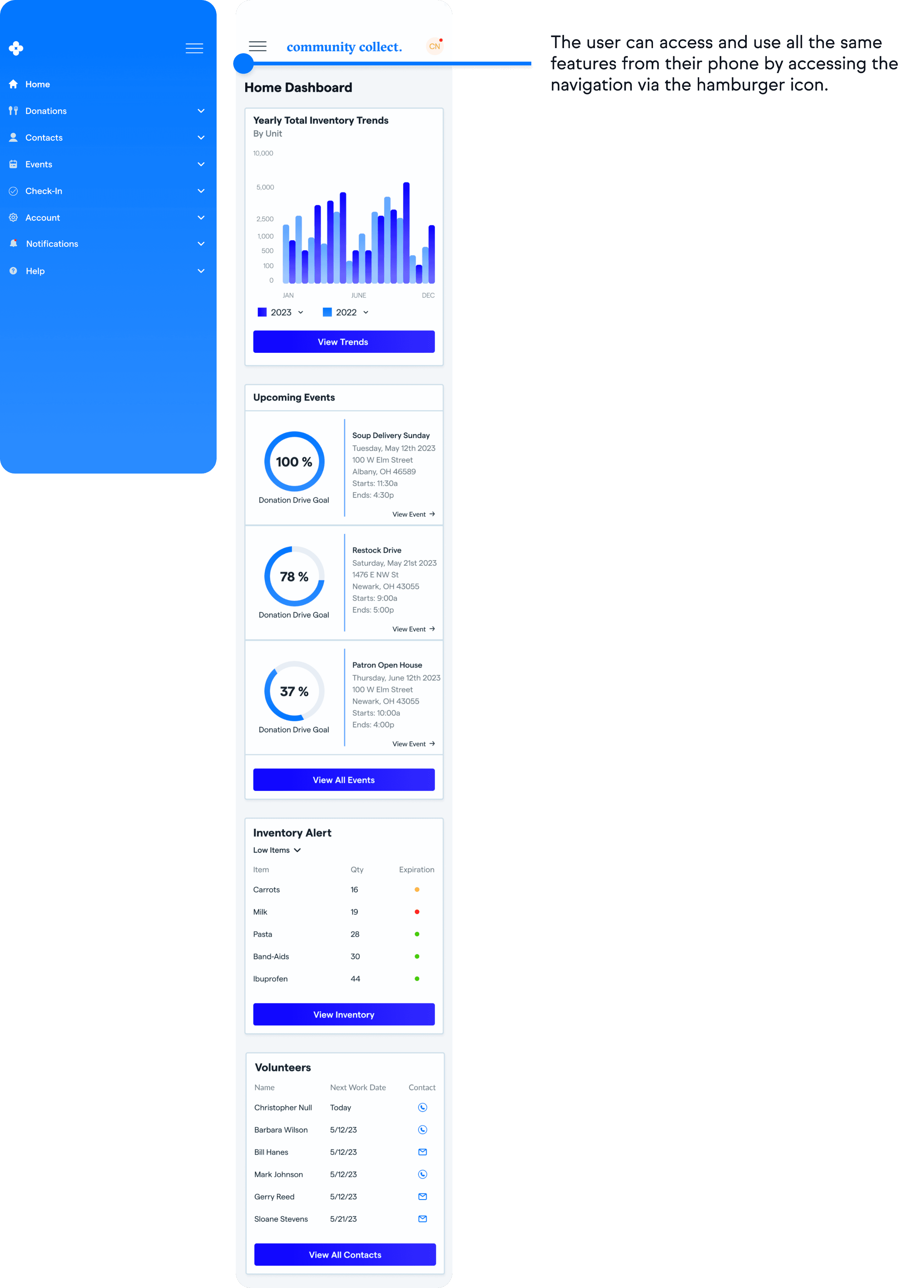
Mobile Home Dashboard And Collapsible Menu
Mobile Search Inventory, Item Quick Edit, Add New Item And Completed Item
Mobile SKU Scanner To Add Items
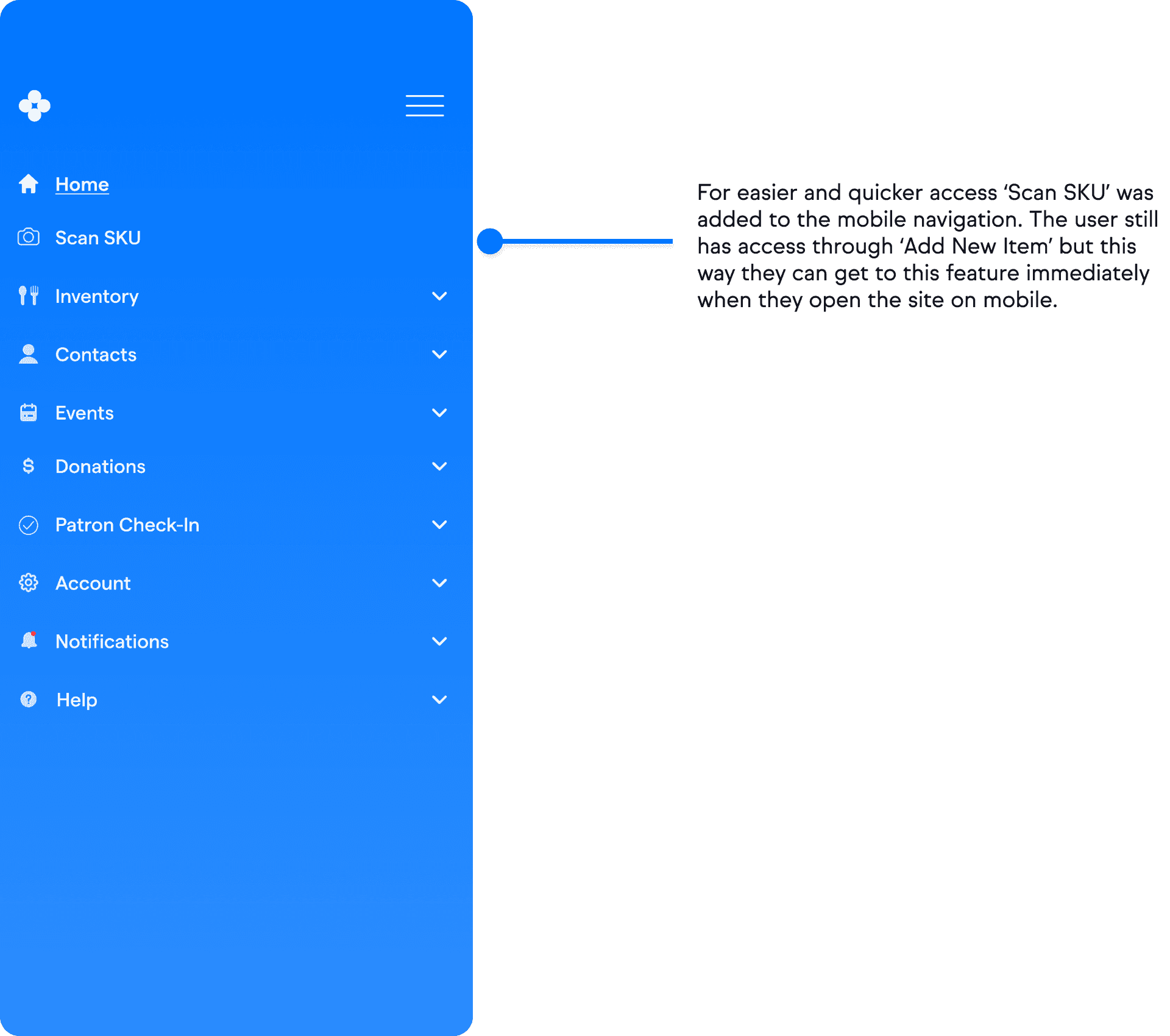
The SKU Scanner was a key feature to have from the research. This first version only has one access point to the feature. An additional access point was designed after testing.
Methods: Prototyping and moderated ‘click-through’ usability testing
Goals: Analyze the ease and usability of the design and synthesize the results
After designing my first iterations of high-fidelity screens, I set them up to be prototyped and tested using Figma.
Add New Items To The Inventory.
Generate a ‘New Report’ From The ‘Trends Page’.
Add New Items To Inventory Manually.
Add New Items To Inventory By Using The SKU Scanner.
5 users participated in the testing. An interview script was prepared beforehand and each session was done via zoom.
Success Metrics, Task Completion:
All users were able to complete the tasks except one issue came up around navigation. 2 out of 5 users had some issues with the labeling of ‘Donations’ in the navigation menu. Not realizing that’s where they might be able to access the non-inventory. Will address in key takeaways below
Success Metrics, Average Time on Task (please note, users did not have to fill out any fields or forms):
Desktop, Add New Items To Inventory: 3 minutes
Desktop, Generate a ‘New Report’ From The ‘Trends Page’ : 1 minute 30 seconds
Mobile, Add New Items To Inventory Manually: 2 minutes seconds
Add New Items To Inventory By Scanning The SKU Via Mobile: 2 minutes 30 seconds
Success Metric, Overall Aesthetic And Visual:
Each user felt good about the overall visual theme, color and aesthetic with some notes about the UI and hierarchy which I will address in key takeaways.
To fix the issue with the two users not knowing where to get to the inventory I plan to change the ‘Donations’ nav to ‘Inventory’ and make ‘Donations’ its own category for managing monetary donations.
Two users had issues with the ‘Add An Item’ page on desktop. The containers and fields were designed in such a way where the user had to scroll to complete the form. I think it was an excellent point and have come up with a way to keep all fields on one page with no scroll which I will show in iterations.
One user had difficulty understanding where to go in order to ‘Scan the SKU’ on the mobile task flow. She discussed how she was looking for the directly from the navigation. I think a nav item should be added for that for the mobile design.
One user had an issue with the ‘carrot’ icon being used to present a ‘pop-up’ modal, very good point and will address in iterations.
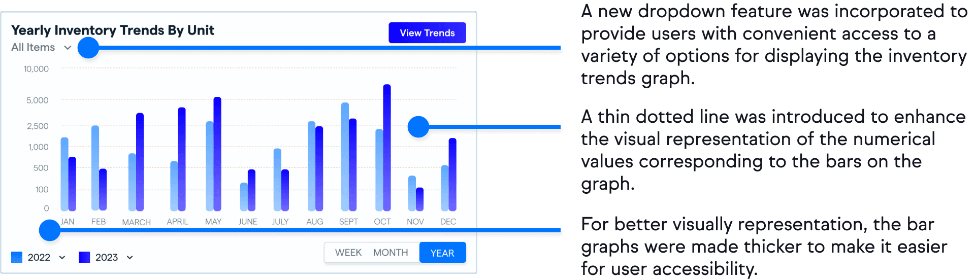
One user wanted to see horizontal lines on some of the graphs in order to have better visual accuracy of the numbers being represented.
Methods: Iterate and review
Goals: Take key findings and refine the design
Desktop Inventory Trends Graph Iteration
Icon Changes Under Inventory Search
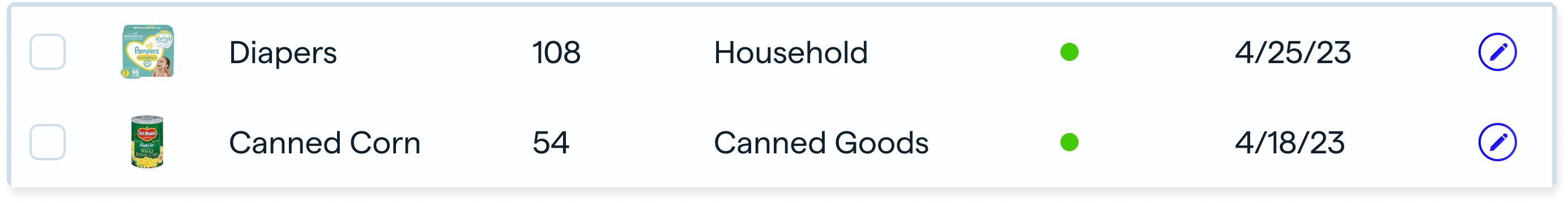
Inventory Search Before

Inventory Search After
Desktop Add New Item Page And Navigation Menu Change
To improve clarity in the navigation, inventory was included with the sub-navs being ‘View Inventory’, ‘Add New Items’ and ‘View Trends’. ‘Donations was made it’s own navigation and will specifically deal with any monetary donations for the non-profit.
A redesign of this page was done so the user would not have to scroll to see all the boxes and fields.
Scan SKU Added To Mobile Navigation
Back To Home Button Added To Completed Item On Mobile
Community Collect
Next Steps
Design and develop the ‘contacts,’ ‘events’, and ‘patron check-in’ areas of the dashboard.
Design and develop the ‘reporting section’ further to show how users could generate a ‘custom report’ of inventory trends.
Expand user testing to validate/iterate on all designs.
Brightguard Sunscreen
End-to-end internal facing application for one of the leading sunscreen dispenser companies in the United States.
Netflix
Putting the power of search back in the hands of the user.